
YALDI (Games Studio)
WHOLESOME
This was a time-limited piece of work for a small games studio. The goal was to 'let players access information from the game ad-hoc from a browser on PC and mobile devices'. My design was a website that reflected the aesthetics and logic of the Wholesome game, and allowed players to use the game knowledge in real life.
- 5 days of work
- Mural / Figma
Please note that icons were not designed as these would be created by the game artist for continuity. The font shown in designs is very close to that of the gameplay.
The Brief
we need to consider the player's goals and motivation
The brief was very detailed and specific in many aspects such as the information to be displayed right through to a step-by-step of the customer journey from game through to the website. The key points were:
- Context:
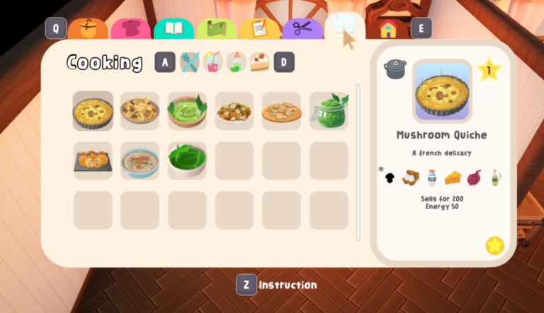
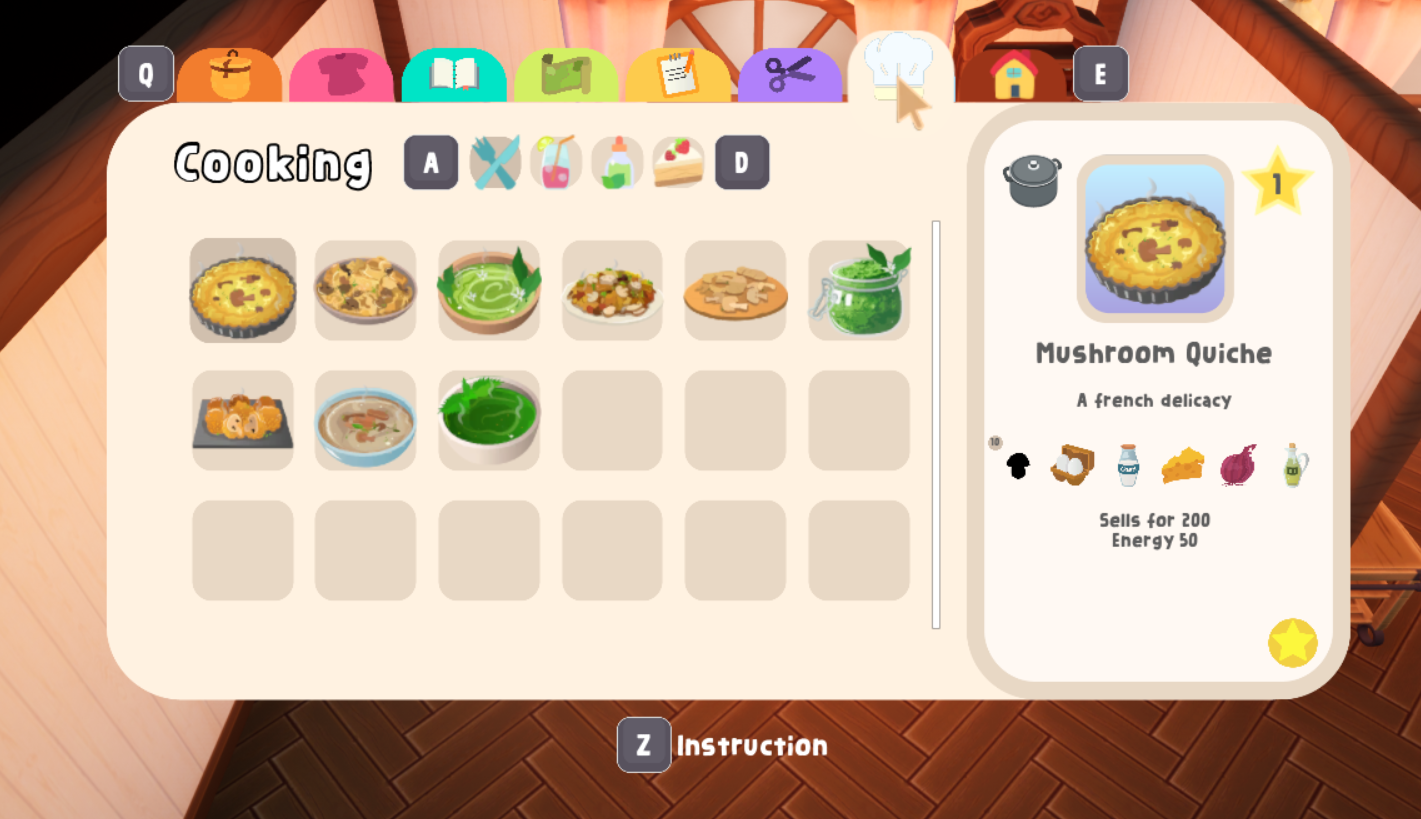
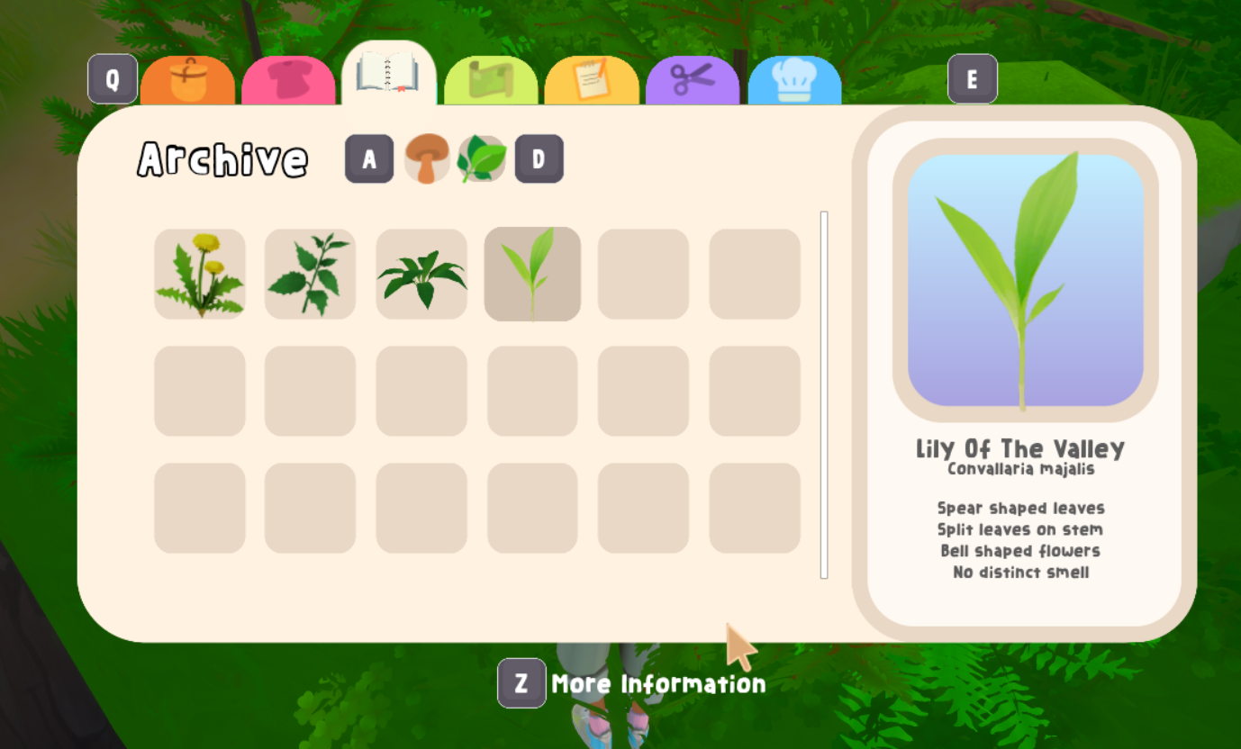
- the game is about foraging for plants and fungi and then cooking recipes with them; there is data on foraging items, recipes and crafting
- It will be available on PC, Xbox and the Nintendo Switch
- unlike the game, the website has step-by-step instructions on how to create the item
- Journey:
- the player will scan an in-game QR code which will take them to the website
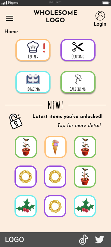
- first see a ‘recently unlocked’ category
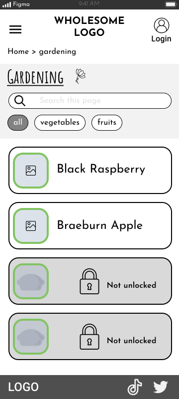
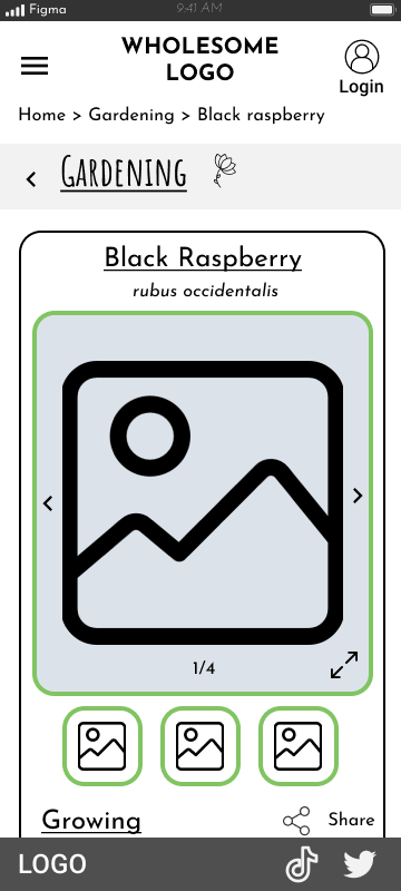
- categories and sub categories, with item images and text linking to further detail
- users will be prompted to create a profile in order to save the data (password, username, email)
- Visual:
- use of tabs (to reflect gameplay)
- lots of images
User Journey
Considerations
Firstly I needed to clarify the journey from game to website. For Xbox and Switch, the scanning of a QR code made sense – the user could pick up their phone and scan to get to the website. This led me to a mobile first approach.
However for PC players, it might be more common for them to open up their desktop browser – they’re on the PC anyway! For this I highlighted a button or link option might also be needed for the PC version.
I then posed the question, “What are the player’s goals and motivation for going to and using the website?”. This hadn’t been fully considered but we determined it would be to access recipes and crafting so they can do it in real life. This led me to prioritise ease of access and clarity of information within the designs.
Another important part was future-proofing the design as much as possible. The client had lots of ideas of how they wanted the website to develop and offer more over the long-term. To help with flexibility, I went for a modular approach with the designs. Parts could be moved or re-ordered as complexity increased, but the whole website wouldn’t have to be redesigned.
Challenge
An issue that often comes up in design is when a brief is specific in the features and that creates a sense of inflexibility.
Having sketched out some initial screens prior to the debrief, I realised the 'tab' approach wouldn't translate that well to mobile and desktop. I discussed this with the client, explaining using my sketches some of the issues and I was allowed to gain more creative freedom in my approach.
Benchmarking & Research
As a starting point I asked the client what had been the inspiration for the gameplay itself. These included Pokemon and Stardew Valley and then a personal passion for foraging and botanicals. The aim was not to look so much at how other games provided a similar experience, but more on how best to order and present the information.
I recognised from the brief that essentially the website was to be a database that a gameplayer can utilise in real life. There was also talk of expanding the items players could forage and garden over time – the database was only going to grow and become more complex over time.
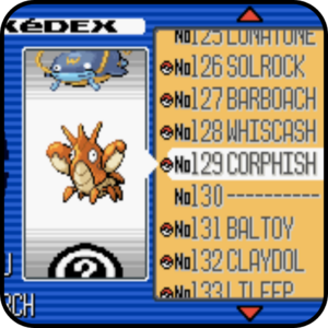
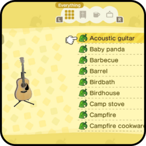
The Pokédex was a great reference point for how to scroll through a lot of items on a high-level, but then being able to select one to see more detail; this represented the information heuristic well. A more recent example I also drew from was the item catalogue in Animal Crossing which from my own experience was expansive, but still enjoyable and possible to navigate.
I then looked to the different types of information that would be presented on the website which included recipes, crafting, foraging and gardening.
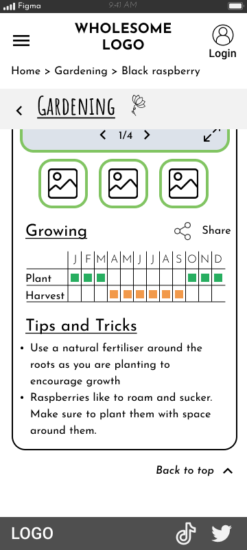
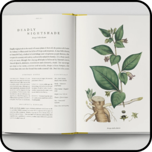
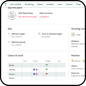
For foraging and gardening I dove into my bookcase to look at botanical encyclopedias as well as the RHS website to see how they presented key information such as changing seasonality. Visuals are very important and the use of tables and icons was a key way to show quite extensive amounts of information.
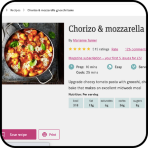
For recipes and crafting I headed for the BBC Good Food website and also my own crafting books. Again icons were used to convey key information such as time, and digitally, collapsible blocks of text were a common approach to prevent information overload.
Key points
- Items are presented with minimal cognitive load with option to find out more detail
- Pokédex style
- Visualisation of the items and information for easy identification
- Icons, tables, use of colour for indication, enlargement of images
- Minimise text heaviness to improve readability and enjoyment
- Icons, colour, tables, collapsible text
- Key points within an item need to present first and foremost e.g. time to cook
- Icons
Reflection
The benchmarking and research was really enjoyable, especially with being able to use physical media to inform digital decisions.
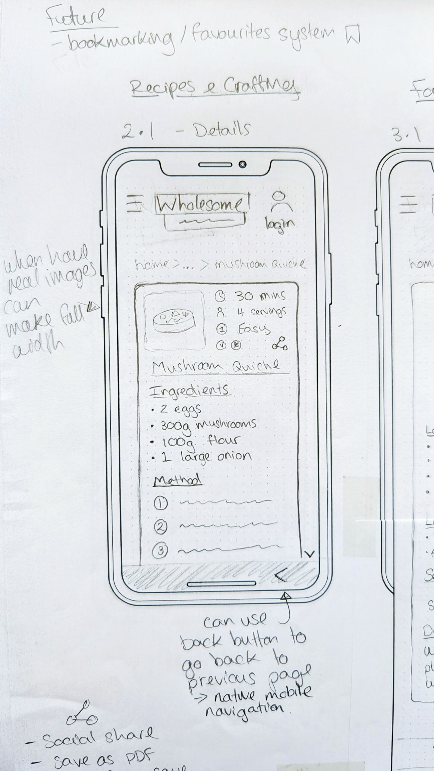
As I worked through the phase I soon realised that key information that a user would want, wasn't going to be presented to them. For example, for recipes, there was no indication of the time it would take to make the mushroom quiche! When I raised this with the client by going through the benchmarking, I learnt that they were some fundamental aspects of the proposition that hadn't been considered.
For me this shows the power of design and the importance of taking time to immerse yourself in the context of the product or service. If we don't go through the same steps our users will, there is a high risk we'll easily overlook something.
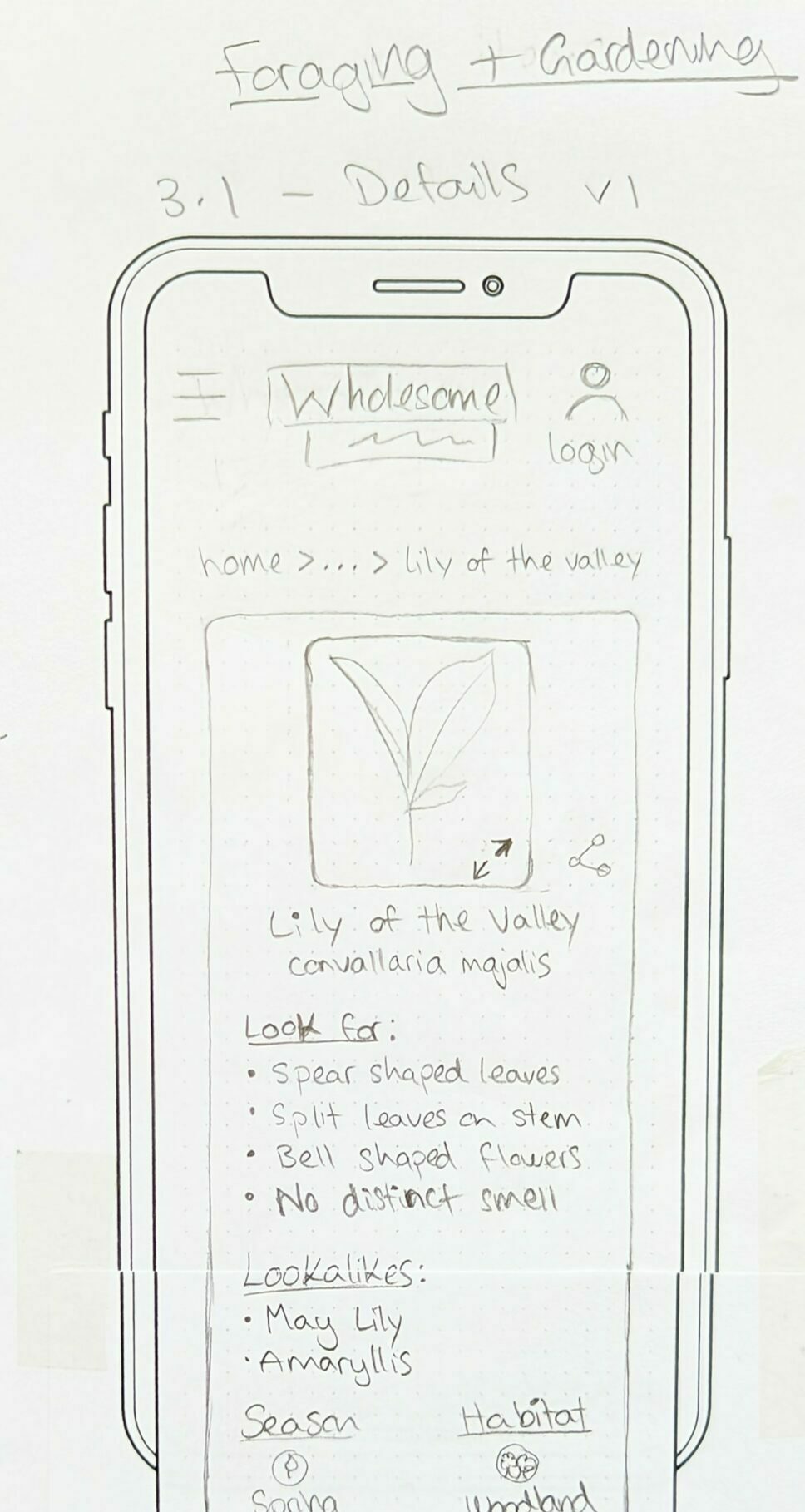
Lo-Fi Sketching
Lo-fi sketching on paper is a technique I advocate for as it allows you to iterate quickly, try out different ideas and with some good music to jam to, helps your creativity flow.
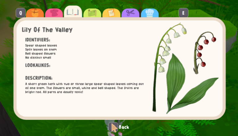
I had images from the gameplay (see right) to use as a basis to ensure a continuity of style and then also my reference points from benchmarking and research.
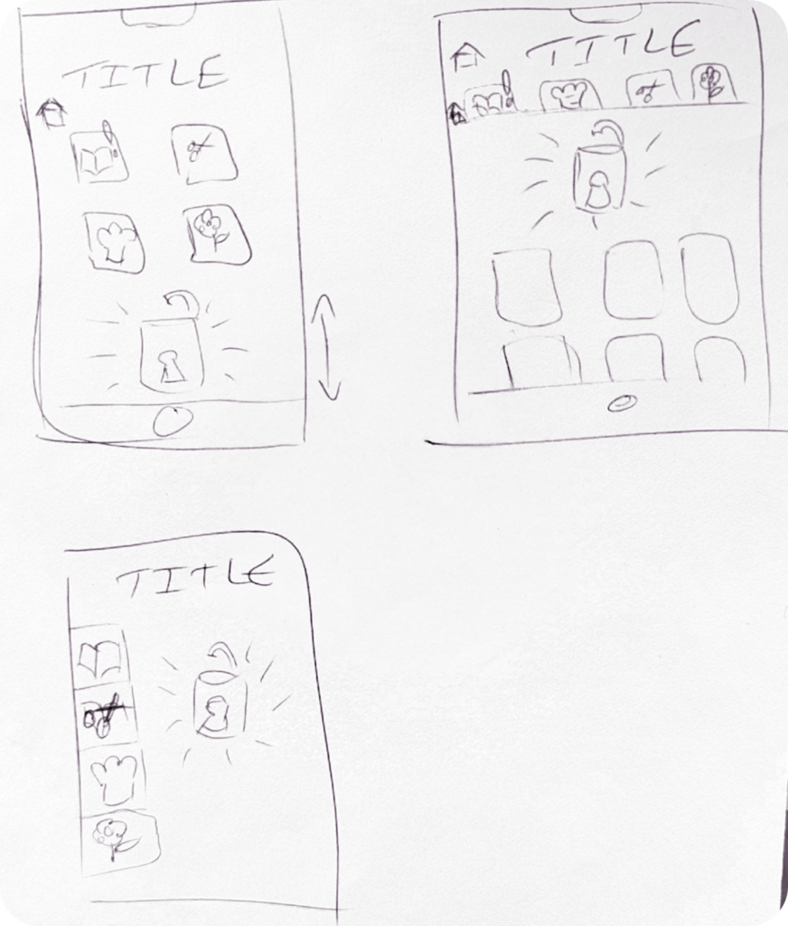
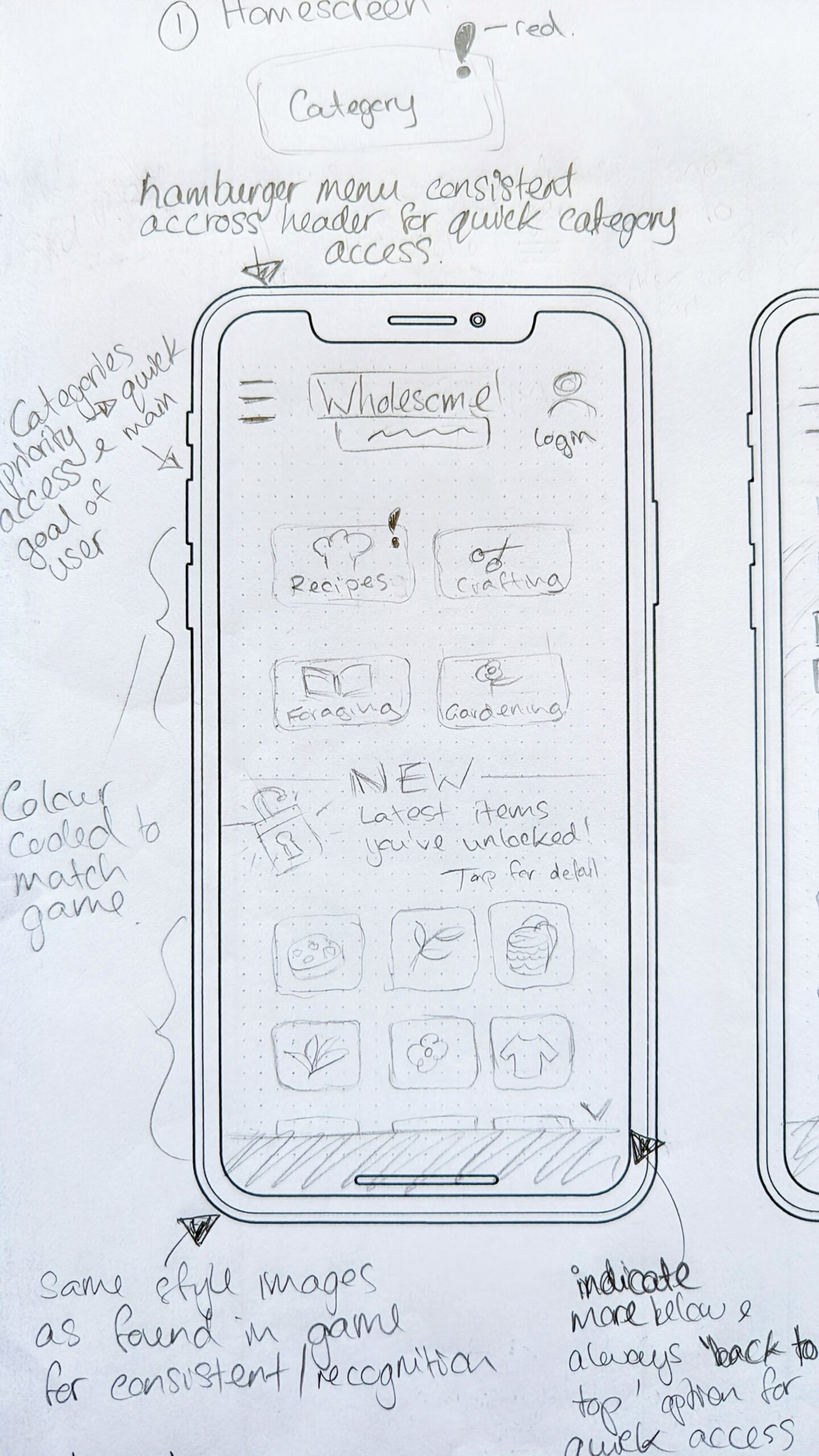
Playing around with the ‘tab’ concept I focused on how easy it would be to navigate it with a touch screen (mobile first) and the visualisation of the information we wanted to show on the landing page which was ‘recently unlocked’ items. I also considered future developments – how would potential future developments such as shopping fit in?
I soon realised that adding lots of tabs would clutter the screen, and so settled on the same concept of ‘areas’ but access would be by square icons in the same style as those found in the game (top left sketch). These could then be easily moved and added to should the website develop further in the future.
Although there were different types of information to present that needed different formats in order to be digestible and readable, I knew continuity was also important. Thus I divided the categories into 2 groups:
- Group 1: Crafting & Recipes
- Key information to include time, ease of doing, resources required, step-by-step instructions
- Group 2: Foraging & Gardening
- Key information is imagery for identification, seasonality, key facts, environment
By dividing up the information types to similar themes, I was able to create 2 key layouts for displaying information, reducing the variance for users and aligning with mental models.
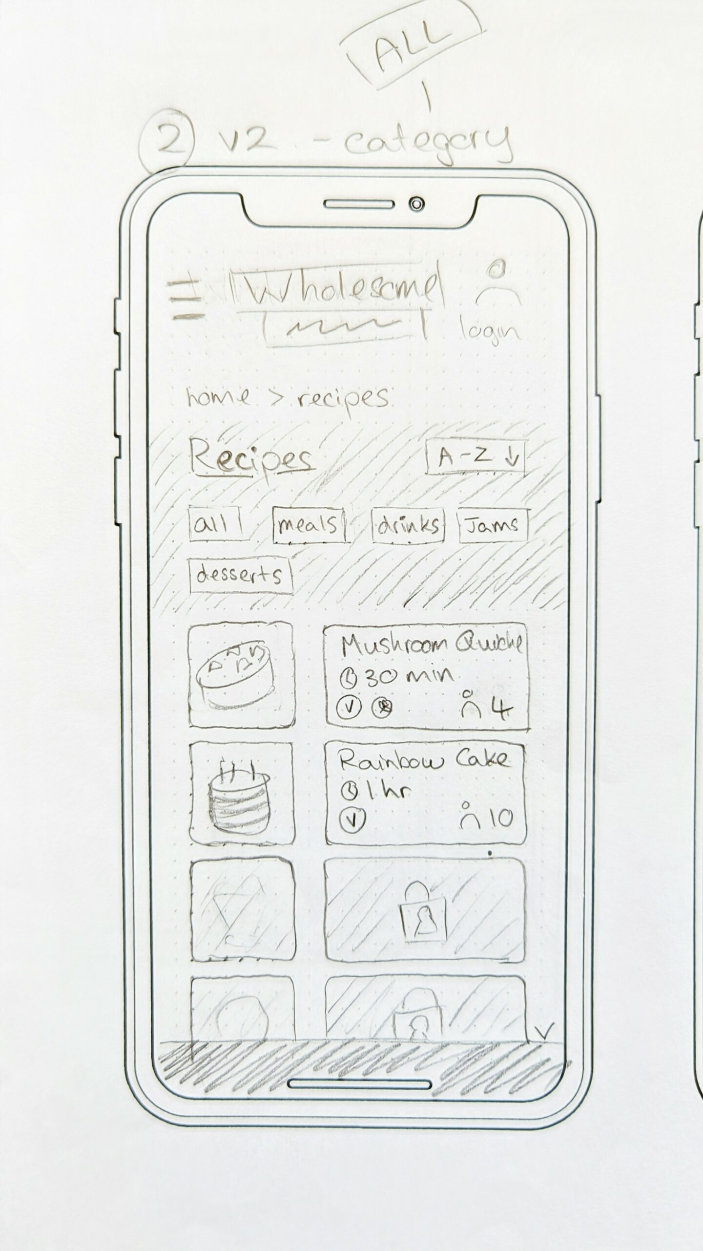
A final point to help with navigation was that of breadcrumbs. It is seen as outdated (from my experience), but in the context of this work and seeing it used on BBC Good Food, it made sense. It would allow users to navigate through categories and understand where they were – most players are coming to learn and so we can’t assume they will understand what category they are in when looking at a particular plant detail page.
-
- Recipes Screen
-

- Foraging Screen
-
- Foraging Detail Screen

Challenge
The brief stated 'recently unlocked' items should be the main focus of the landing page and website. This worked well for someone who had just started the game as there would be lots of unlocked items to see, but what about longer term players? Less and less would be unlocked as they got towards the end; the focus of 'recently unlocked' would become less relevant and engaging to users.
The client wanted the website to encourage real-life engagement in activities such as foraging. Thus that needed to be the focus rather than the limiting 'recently unlocked' gameplay element.
To reflect this I made access to the database of items the main focus in my designs with 'recently unlocked' secondary. It also lead to the inclusion of a search bar functionality and the future development of bookmarking favourite items which could be kept within an account area.
Initial Sketches for Pages
Please note that, at the client’s request, not all design work is being shown.
Client Response
The client was very happy with these sketches and understood my reasoning as I talked through the customer’s journey of going to each of the areas and how they would explore the information.
We discussed the and filtering functionality which I thought was critical, especially longer term, to the enjoyment and success of the website experience and usage. The client’s didn’t see the value in the sorting functionality, however we did eventually agree that sifting through information ‘manually’ would be a pain as the database expanded. So I put forward that as well as a website search functionality there could be one within each area (recipes etc.) to allow for users to quickly find a particular item.
After the client confirmed they were happy with my mobile and desktop sketches I moved onto wireframes.
Challenge
There were lots of ways the website could be developed to provide an amazing experience, however I was conscious of 2 key facts:
1) The client was so enthusiastic and had lots of different ideas whereby it was easy to go off course
2) There was a limited budget and limited time that had to be respected
My approach was to suggest and highlight functionality that would be MVP and ensure a good user experience from the start. Then as I worked through the design process, I made a note of future developments that could be implemented and included wireframes of how these would fit into the design.
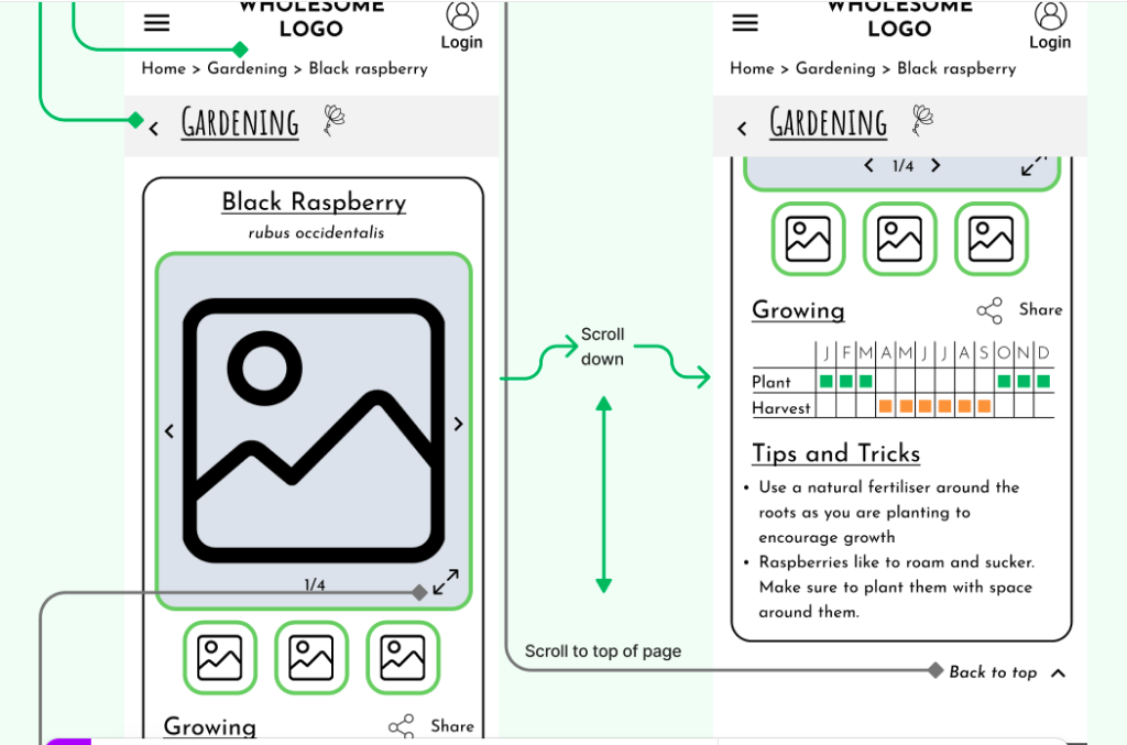
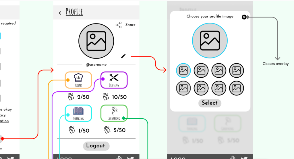
Wireframes
Creating the wireframes in Figma really helped bring it to life for the client and allowed me to create simple click-through prototypes so demonstrate the user journey, navigation and type of transitions.
When thinking of the screenflows and interactions, I wanted to keep it simple and intuitive to ease navigation through all the information. To achieve this I included key icons to indicate further interaction (such as tapping on the image to enlarge it), and also allowed for multiple ways to go back to key areas such as the homepage, giving users that freedom of movement.
However, in keeping with the game’s atmosphere of disconnecting digitally and re-engaging with nature, I specified that the screen changes should represent that of turning a page in a book and be ‘gentle’ and not too fast, reflecting the slower nature of the game.
Another key element was to ensure it was easy to socially share any item. Like Animal Crossing, Stardew Valley and other wholesome games, a sense of community seems to naturally develop and fuel their success. Thus by allowing sharing we can cultivate this and also allow user to store information, such as recipes, in a format and place that suits them to use it.
Conclusion
My time on this project was very limited due to budget but it was very enjoyable. The client was very happy with the designs and felt they reflected the game whilst providing clear information for users.
I shared my thoughts and designs for future developments to the website and also strongly advised A/B testing with users to make sure it flowed for them and made sense. They would also be able to test different designs and measure the impact on performance.
What did I learn?
Working with the client directly and receiving direct feedback was really enjoyable and allowed us to have some great discussions, and for me, to bring the game players to the heart of the design. It took me back to my time as a sales specialist when I would work 1-2-1 with my clients, carefully crafting their holidays.
Something I was reminded of on this project was the power of deciding not to do something. The client was incredibly creative and full of ideas which was great, but we could have very easily overwhelmed the website and user with all our ideas. Simplicity is key, as well as a stop and measure approach so these decisions can be informed by data and behaviour.
What would I have done differently?
It would have been great to have tested with users but time did not permit this. I would have tested the transition from game to website for the user – was it easy? A surprise? What did they expect would happen?
Also testing the hierarchy and navigation of the information would have been good to observe in a Usability test as although I referenced existing ways of organising the information, it was ultimately assumptive that user would find this approach logical and importantly enjoyable.
What would I like to do next?
The area of omnichannel interaction and connectivity is exciting and I would very much like to consider and design more ideas on how to provide users an enjoyable transition between devices and mediums.