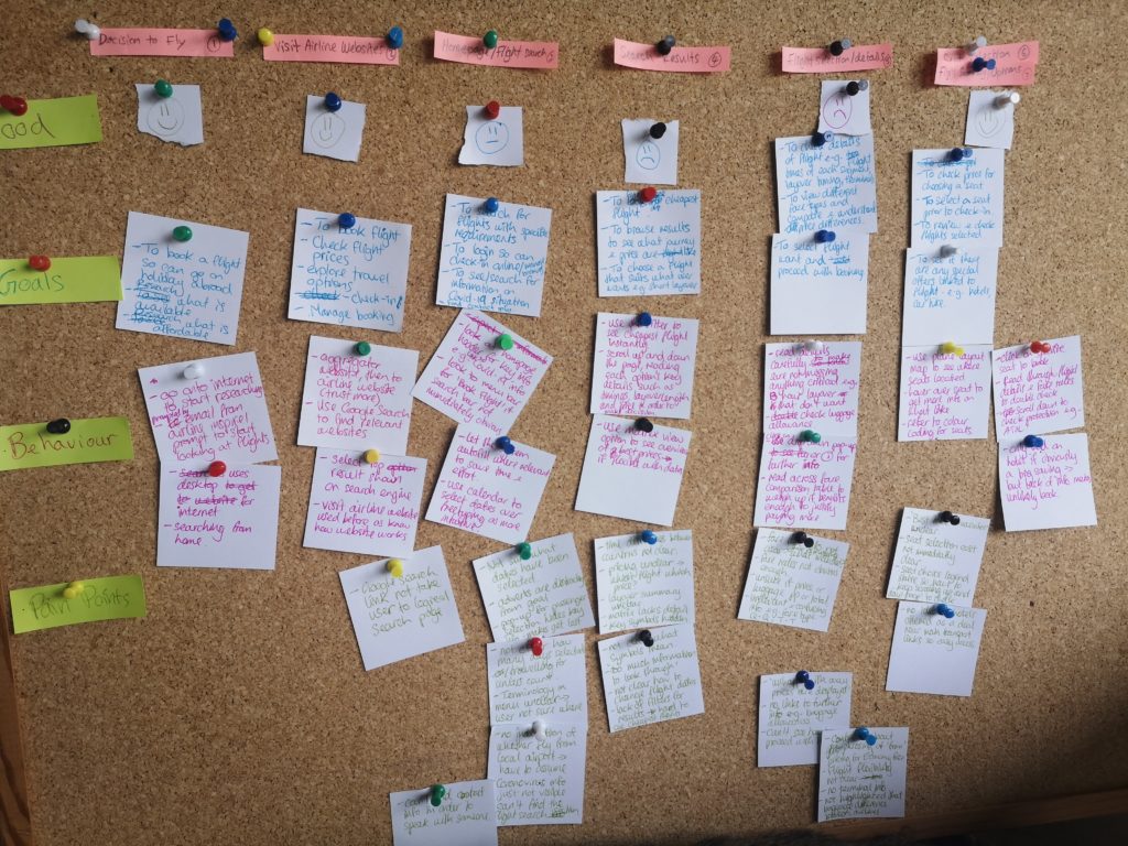
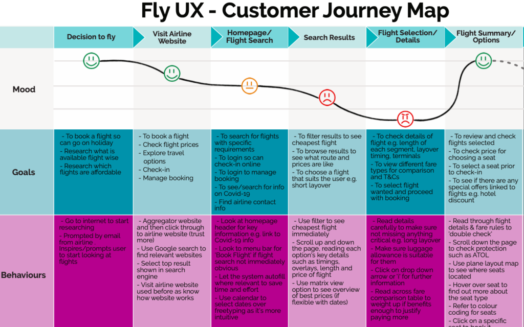
Interview
The interview provided an opportunity to ease the user into the overall experience and also allowed me to gain an understanding of the context in which they would normally be booking flights. With the pandemic meaning there was a lack of recent flight experience I felt this aspect had more weight to it than usual.
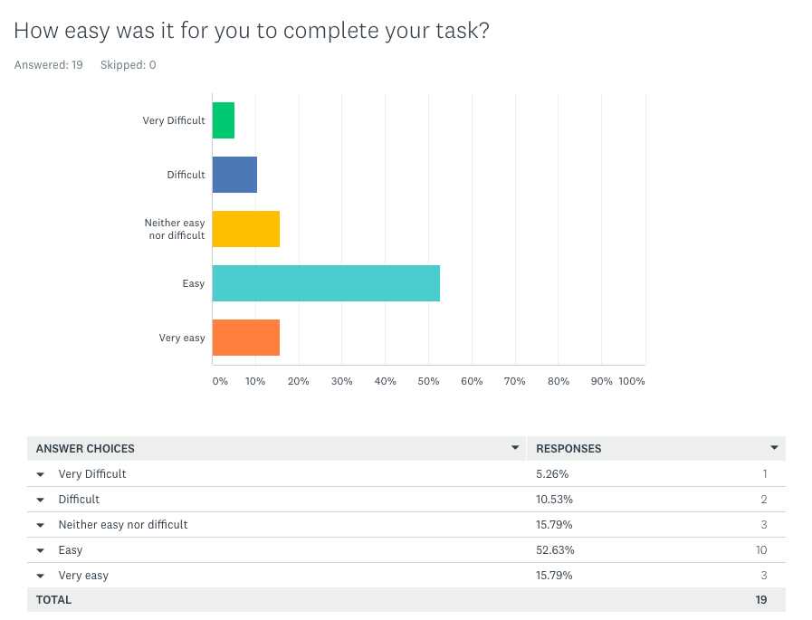
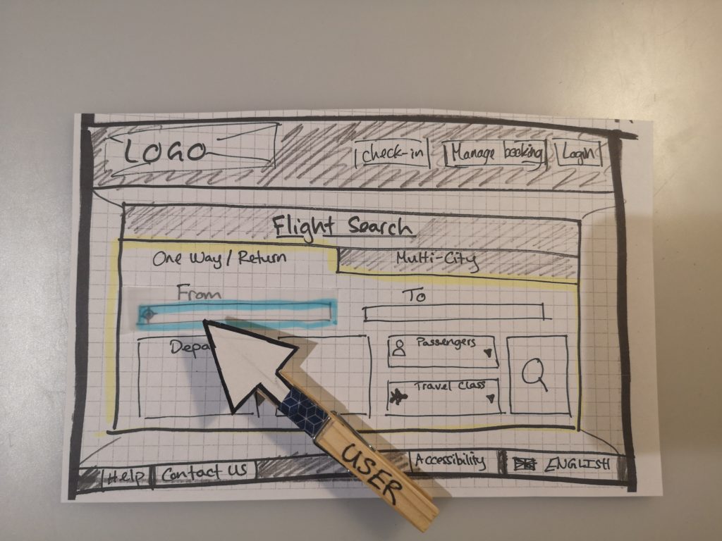
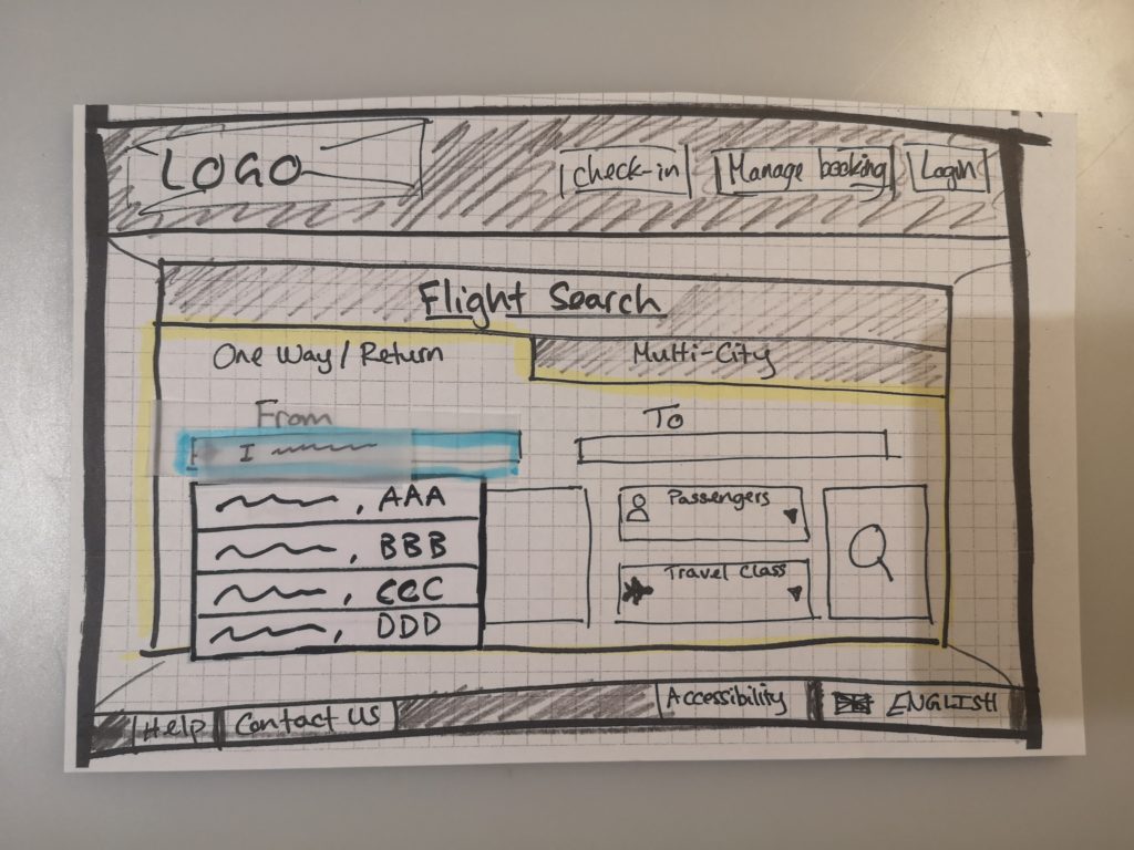
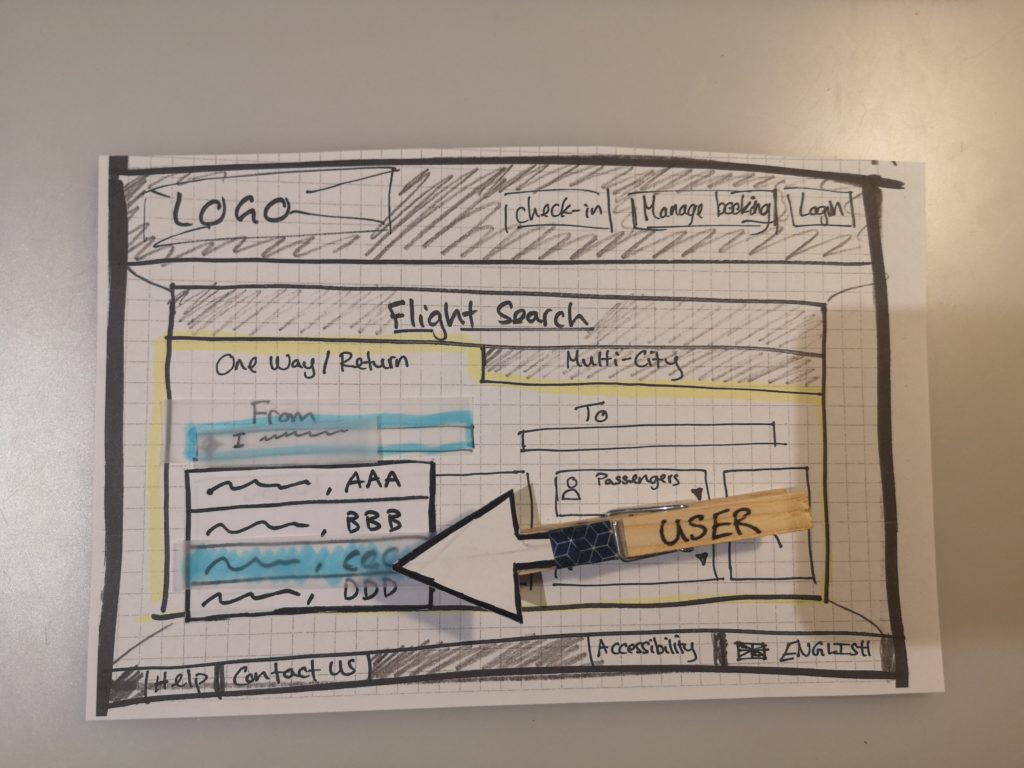
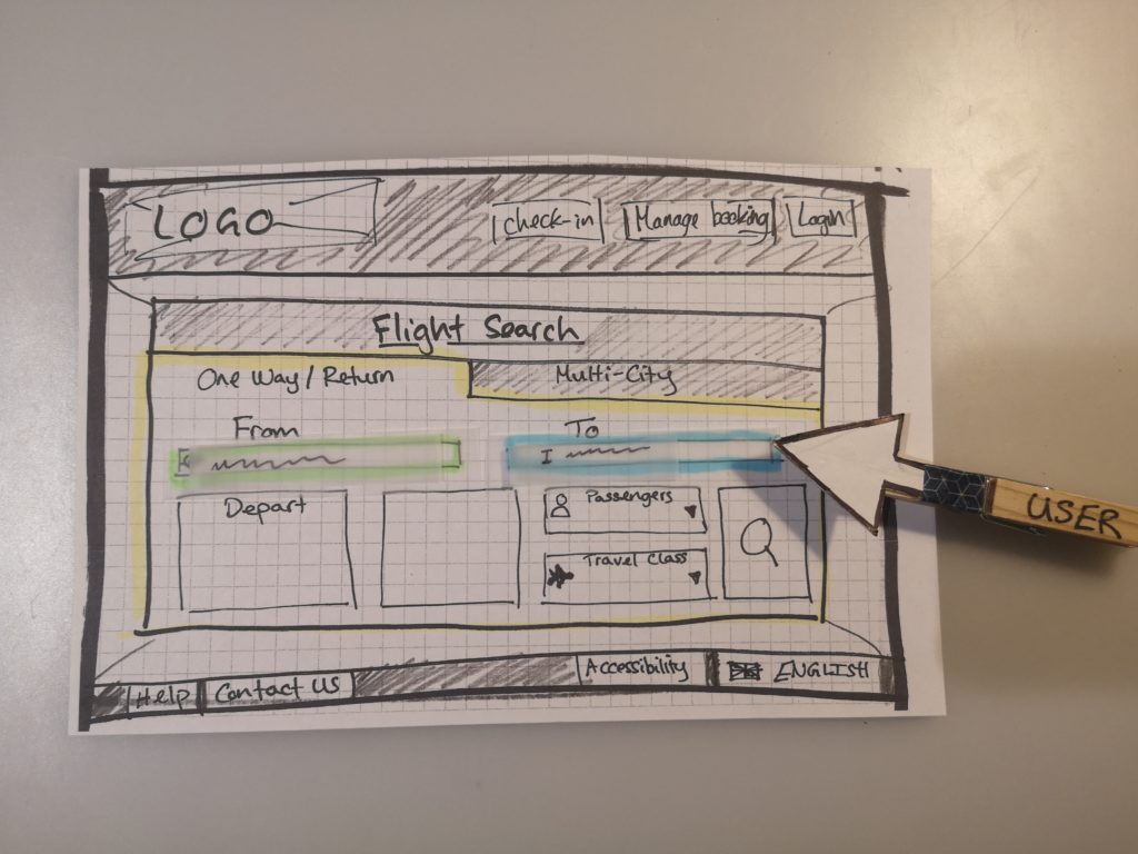
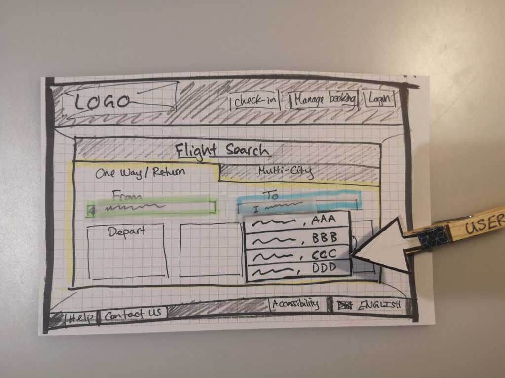
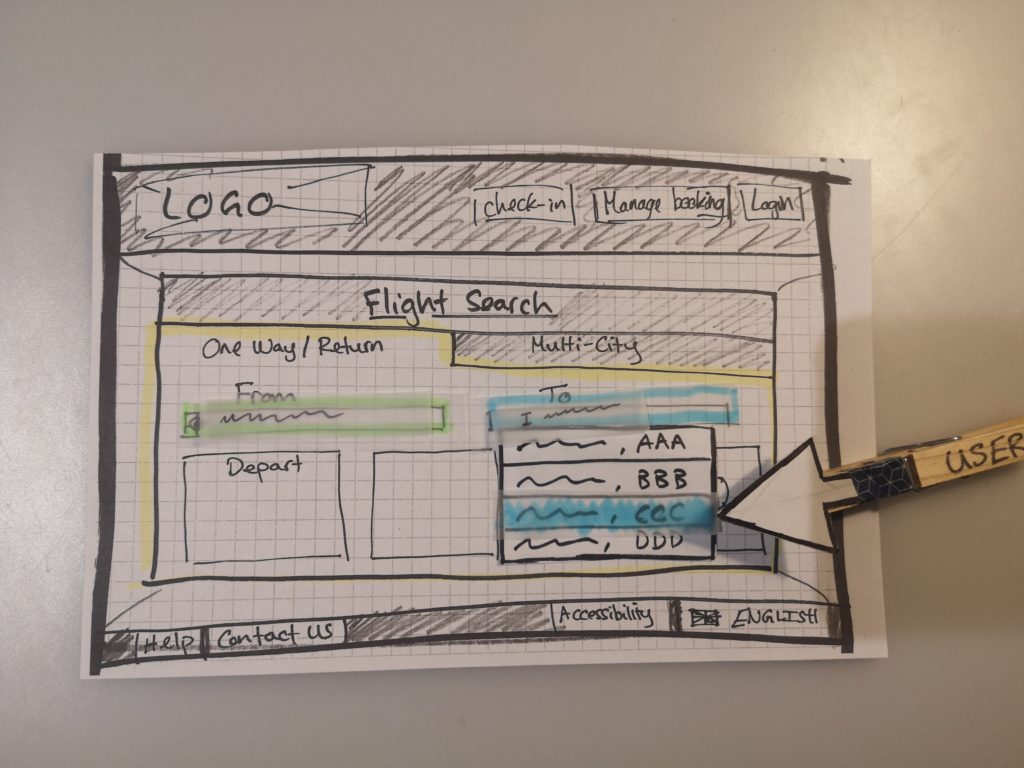
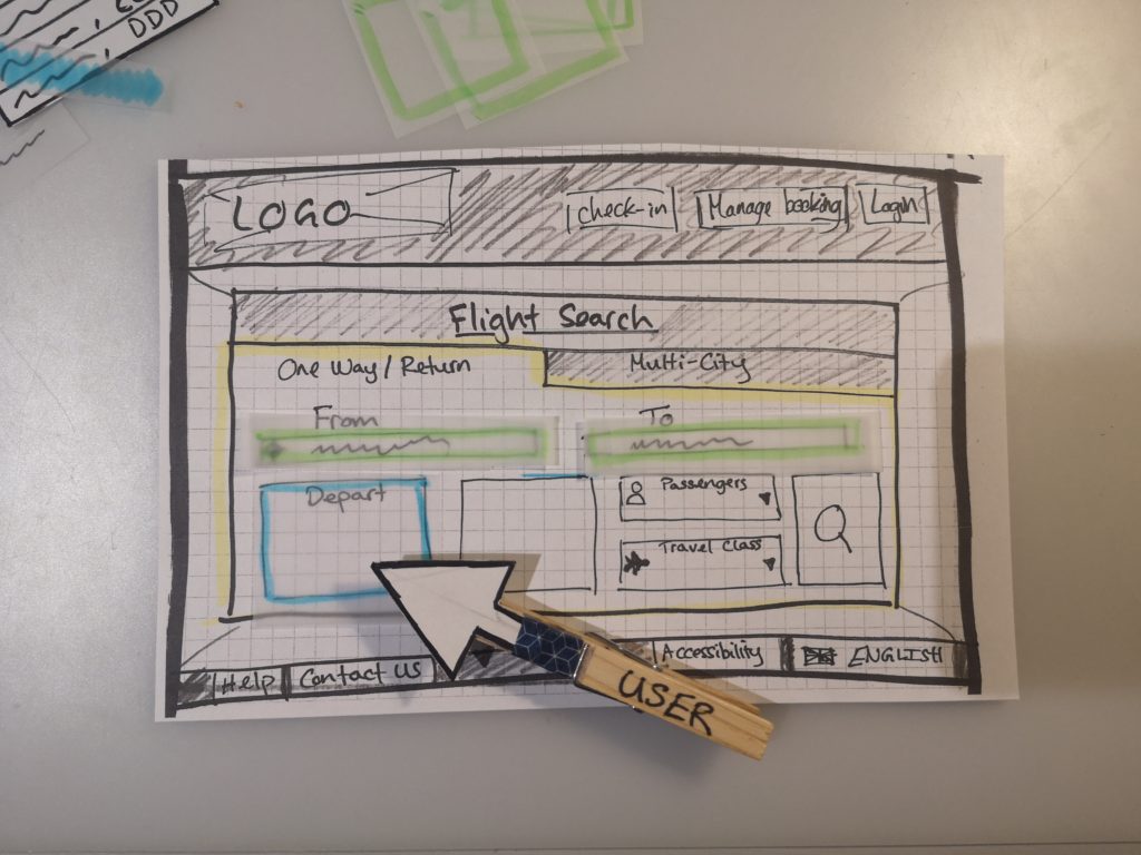
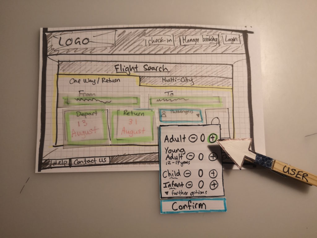
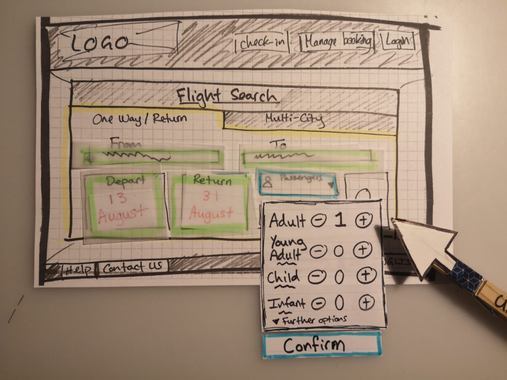
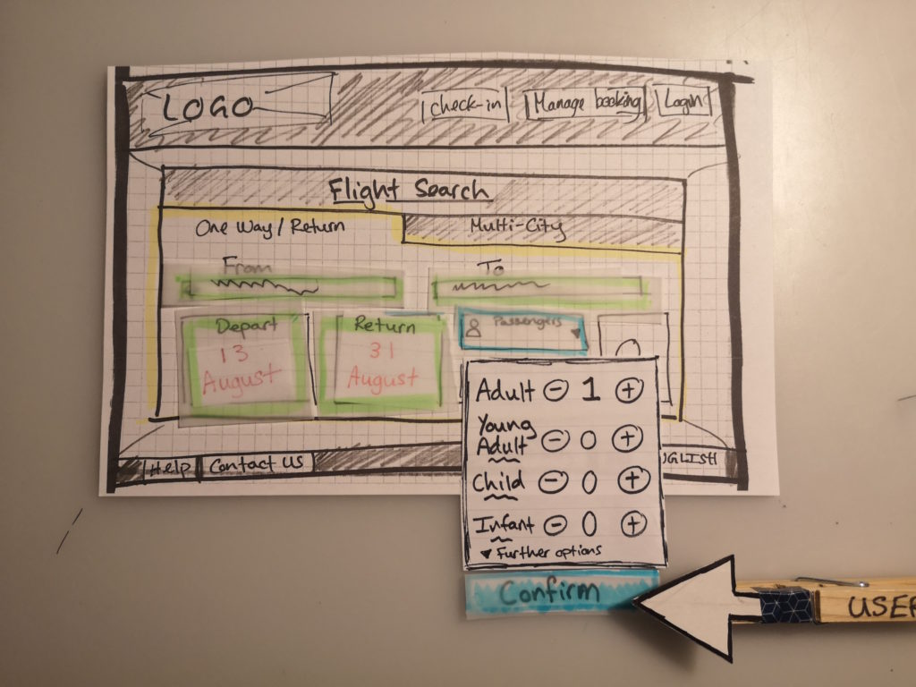
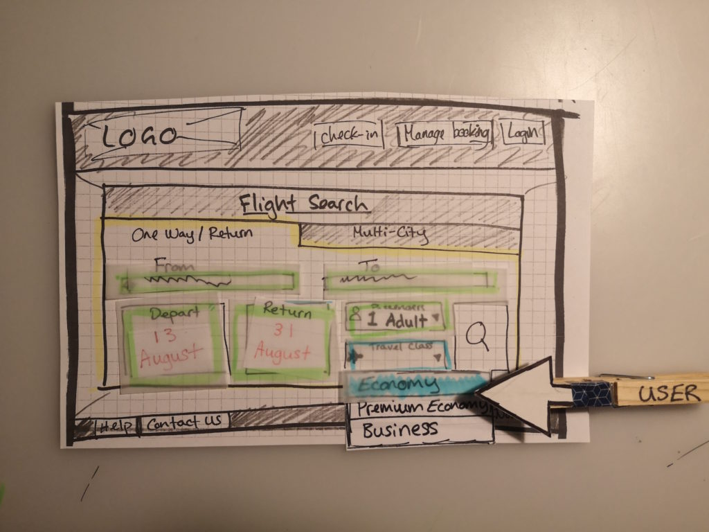
Usability Test
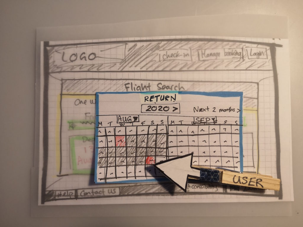
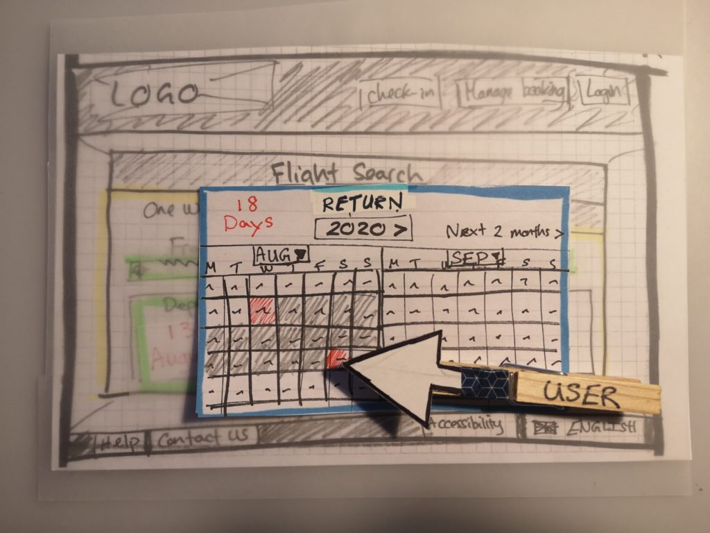
I was able to conduct this usability test in person rather than remotely which became particularly useful when the user 'got lost' on the BA airline website. This led to the most challenging aspect of this test which was balancing letting the user go through their natural thought process on how the website should work but also helping them get back on track. I did this by asking questions relating to the task which helped guide the user back to the relevant area of the test. However at one point I did need to point out the link to take them back to where they were aiming to be and from there the test went much more smoothly.
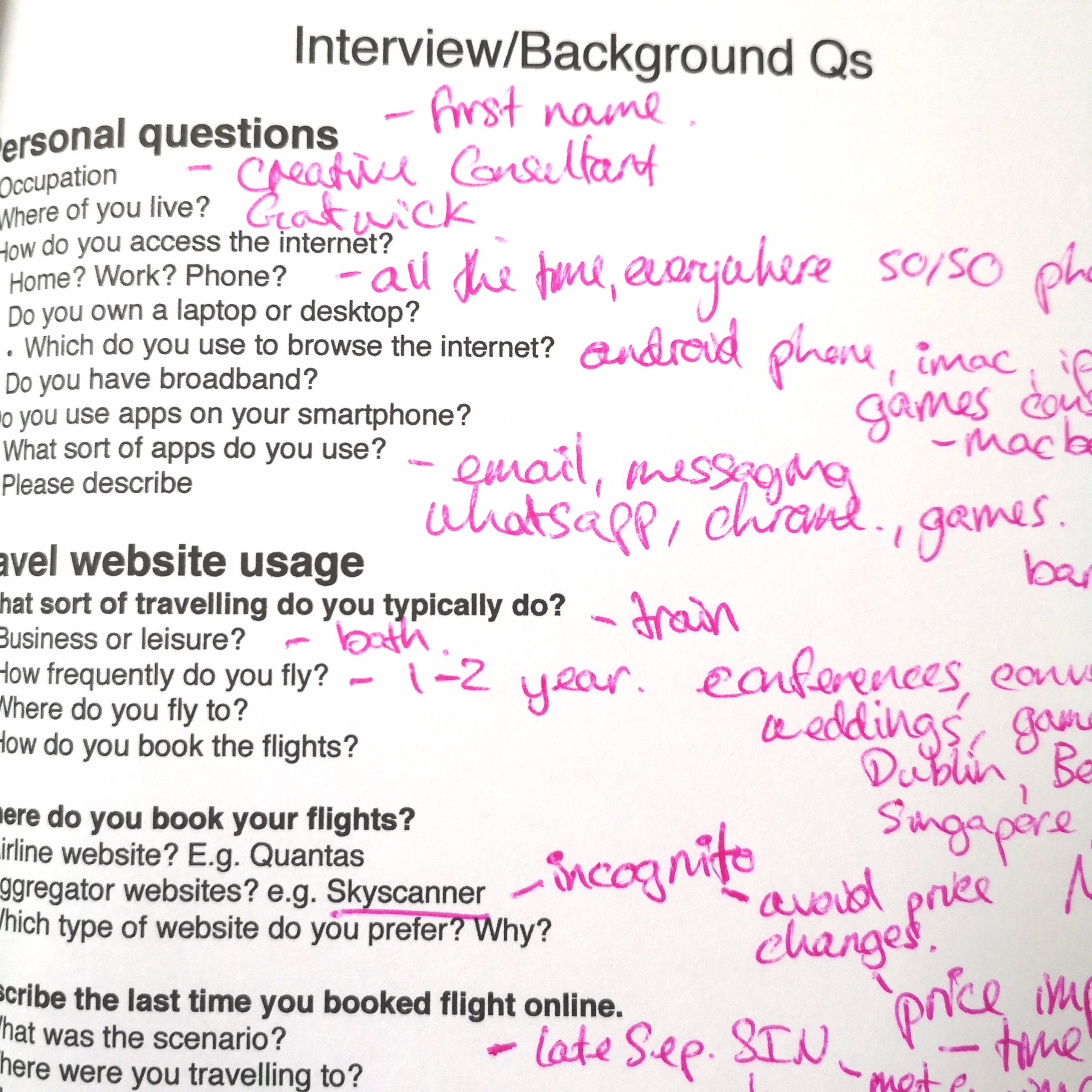
Note Taking
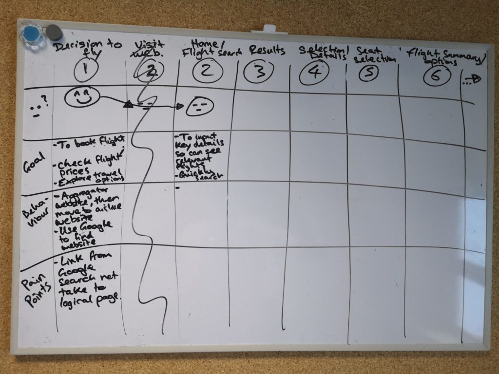
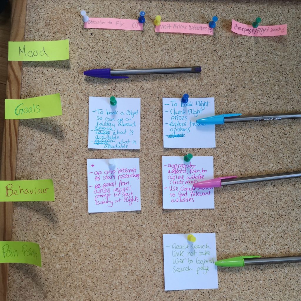
With the note taking I decided it was relevant to include times for when key points were made by the user and at the start of sections. This helped make sure that when I reviewed the video footage it was easy to find the right section when I wanted to confirm comments the user had made.
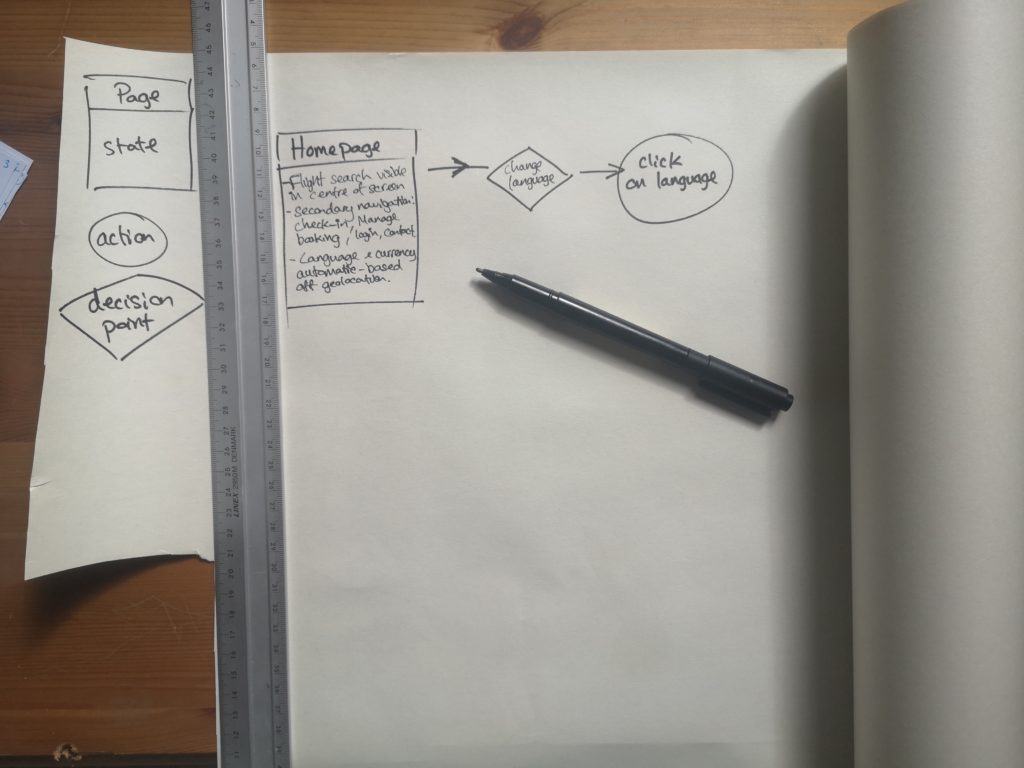
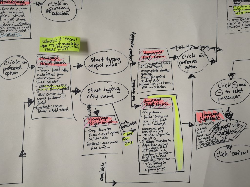
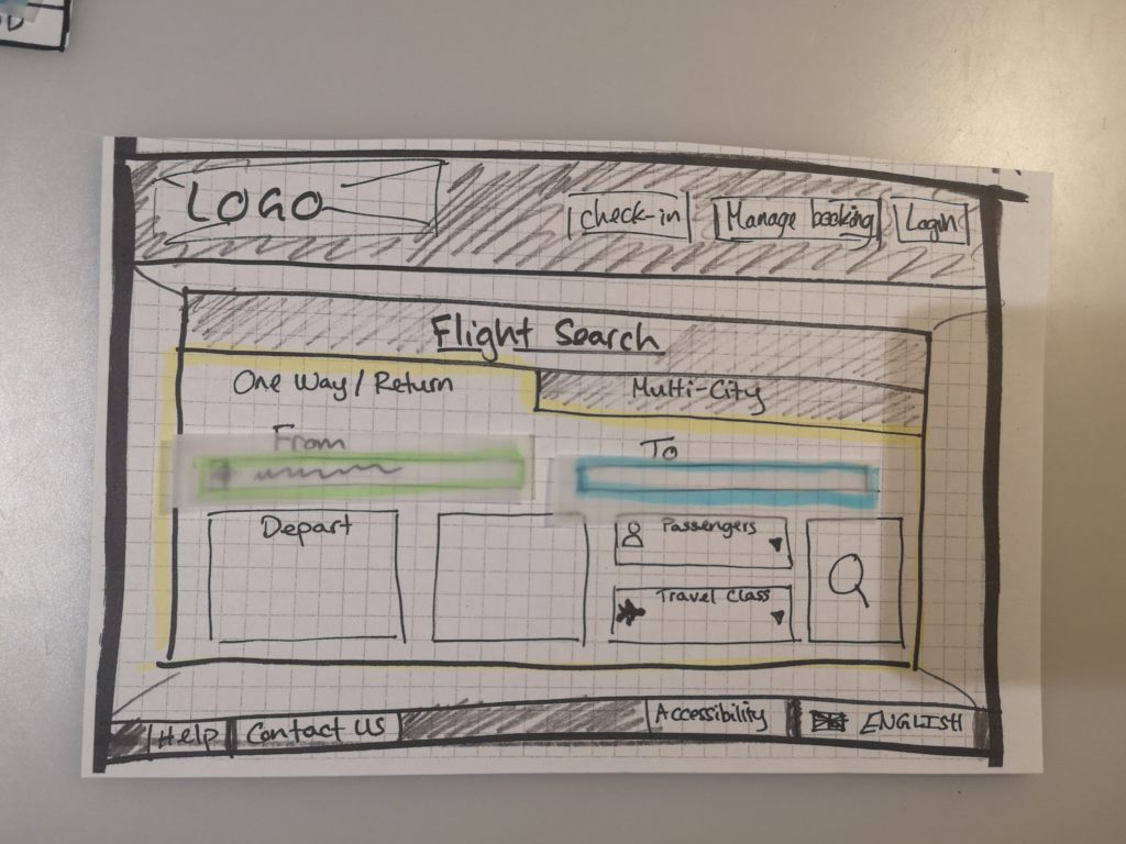


Drag