CASE STUDY
FLYUX
FLYUX is a desktop website prototype created to solve issues and frustrations users face during the flight booking process. This project was part of the UX Design Institute UX Designer Diploma and allowed me to apply the UX principles and methods I was learning to a practical project. This helped me gain a much deeper understanding of UX as well as the challenges faced when applying methods and theories to reality.
Phase I - Research
...and how I find out I don't know!
- Competitive Benchmark
- Online Survey
- Note-Taking
- Usability Test
Competitive Benchmark
Objective: Learn how best-in-class websites and apps solve the flight booking process problem I am trying to solve.
As a starting point to see what airlines were currently doing and the industry best practices, I undertook a competitive analysis of Turkish airlines, British Airways, Qatar and SkyScanner (as an aggregate option).
I chose these airlines and websites using my industry knowledge as I knew they were known for their quality thus I felt they would be good places to see industry best practices.
The key focus points were:
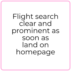
- Homepage: What is the visibility of the functions? The ability to book flights
- Search and Select: How efficient is it? Is it clear? What is the filtering like?
- Entering details: How is it laid out? Does the order match my logic?
Insights
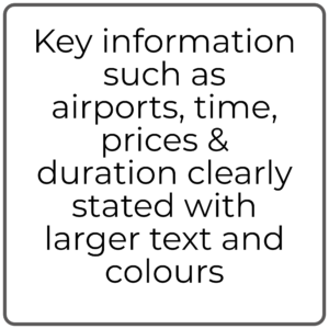
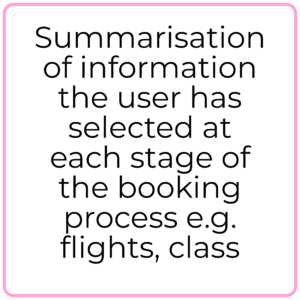
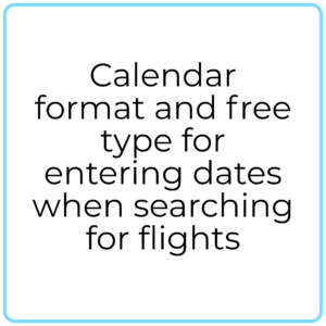
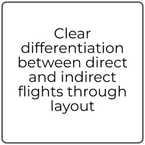
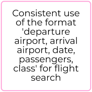

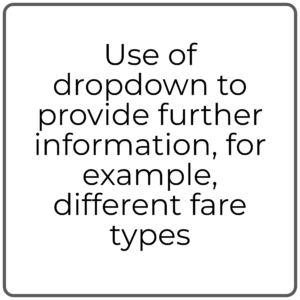
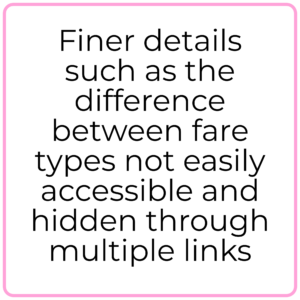

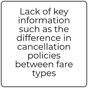

Conclusion
There were plenty of best practices in terms of layout, formatting and iconography that would be good to investigate in the Usability Tests to ensure they fitted the user’s mental model and thus replicate in my own design. However there were also points, such as the terminology, that even to myself seemed unclear and definitely misleading at times. I was keen to see whether these were key issues for users and to design and test alternatives that would help create a better user experience.
Challenge
With the pandemic grounding pretty much all flights, it was really hard to search a viable flight option!
Reflection
I was excited and particularly enjoyed the Usability Tests in this phase as it was very much like my previous role as a Japan Specialist at a travel company. Listening to the client, understanding what they are actually saying, and diving deeper with questions really fascinates me and can completely turn any assumptions on their head.
Challenge
Due to my previous experience in the Travel industry I knew I would have to be very careful about not bringing in my own assumptions about what issues users would face and what I felt made a good airline booking process.
Online Survey
OBJECTIVE: Learn more bout the goals of people that use airline websites - what they are trying to do, what (if anything) is preventing them from doing it and what else would they like to be able to do on airline websites.
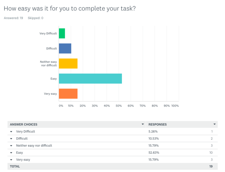
Total Responses: 19
The next step was to actually talk to some users! For this I used SurveyMonkey as it is free and I have used it on a number of occasions and so am familiar with it. From my experience of creating tailor-made holidays I knew it was critical to ask the right questions, rather than a lot of questions if I was to gain any insight.
The key criteria I passed each question though was; will the data from this question genuinely be useful in order to change something? The other key factor was to include the ‘3 golden questions’ I’d learnt from my studies, a mixture of structured (quantitative) and unstructured (qualitative) questions, and finally to ask no more than 10 questions so as to keep it concise.
In order to help maximise the number of responses and not create any bad impressions, I made sure to state in my invitation what the questionnaire was about, how many questions there were, how long it would take approximately (timed myself) and a statement about privacy of information and my eternal gratitude.
Insights
Due to the issue with obtaining recent data and the fact there were not many responses, it was difficult to gain any in-depth insight. However the key goals and a few issues did stand out:
Checking-in (2) , Booking flights (5), checking prices (6), managing an existing booking (3), 15/19 respondents left the website as they were able to achieve their goal and complete their task,
BUT
Around 30% of respondents had trouble finding the information they wanted on the airline website such as customer service contact details.
There was also a lack of clarity of information such as luggage requirements, if the airline flew from a certain airport but also paradoxically having too much information presented to them so they couldn’t find the information they wanted.
Conclusion
Although the data set was small it was clear to see that the main user goals were checking prices and booking flights. This indicated which features on the website would be most important to users but the fact 30% of users had difficulties showed there was definitely room for improvement. Improving what exactly, wasn’t entirely clear from the survey and thus deeper research with Usability Tests was needed.
These answers also gave me direction on which parts of the airline website to focus on for designing my Usability Test Script and think ahead to what probing questions to ask the users when they are doing the test.
Challenge
The Covid-19 pandemic meant it was impossible to get recent (within 3 months) data on people’s recent air travel experiences and so I was reliant on recall which I knew wouldn’t present the best results but would be indicative of common issues.
Also I knew I would be unlikely to obtain a statistically significant number of responses and so the UX Design Institute asked for a minimum of 15 responses.Reflection
I would have liked to have a much higher response rate and thus data set with which to conduct some statistical analysis on based off what I learnt at university. However with much of the insightful data being qualitative it wouldn’t have yielded much more in terms of learning the user goals.
Interview + Usability Tests
Objective: Learn more about the context of use of people that use airline websites. What are they trying to do; who are they with; where are they; what devices are they using?
Learn as much as possible about the goals, behaviours and context of airline customers when booking flights.
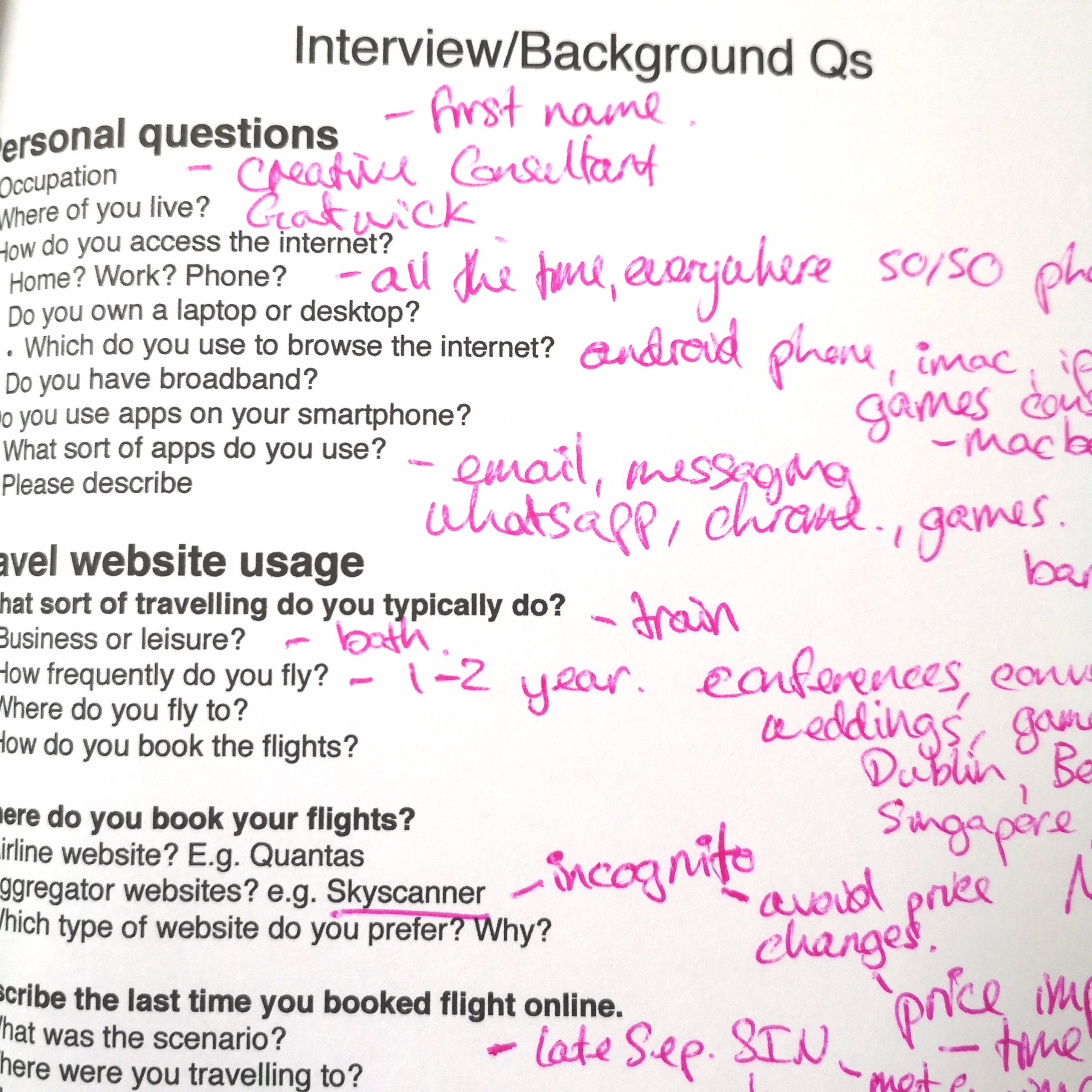
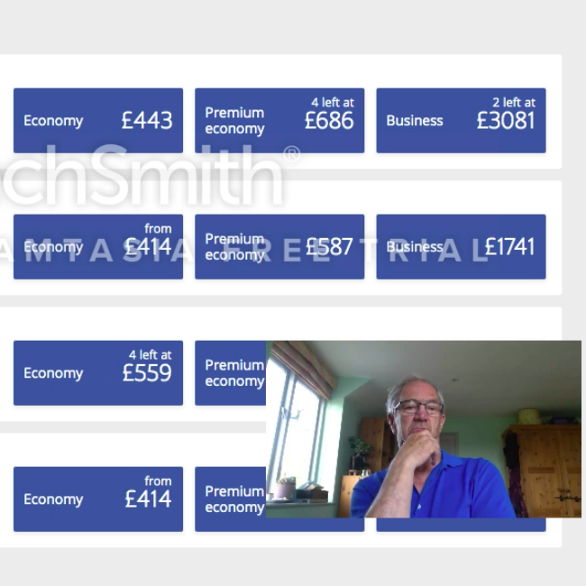
As the Covid-19 Pandemic lockdown meant I wasn’t allowed to meet with other people, I had to rely on my own dad for my Usability Test as he was in my ‘bubble’. I did also use Zoom to run a run-through of the Usability Test with my sister, but due to her knowledge of the industry and lack of airline travel, her feedback was skewed.
Thankfully my dad was a good choice as he flies to Australia at least once a year and had flown about 5 months prior. He is also an engineer and so is not linked to the UX industry at all which helped mitigate any behavioural differences and ensure I got real feedback.
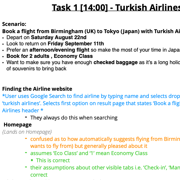
As well as this interview and usability test, I was also able to draw upon two recorded interview and Usability Tests provided by the UX Design Institute from which I had taken notes.
Challenge
Finding people to do a Usability Test!
Reflection
Aside from the guidance from the course and instructors, I was very much inspired by ‘The Mom Test’ (Rob Fitzpatrick) when creating my interview and usability test scripts. Reading this book mainly helped me with thinking about how I would respond to the user during the test and how I would dig deeper without leading the user too much.
This was challenged right a the beginning of the usability test where the user went down a completely different route on the website to book their flight than I had anticipated! It was a fine line between seeing how my dad was naturally progressing through the website, and guiding him towards where he needed to be in order to progress with the test.
Insights
Context
Personal:
- Laptop + desktop user as works from home
- Travels solo approx. 2 times a year to Australia (Tasmania)
- Never used an aggregator website
- Used to use a travel agent but now has the confidence to do it himself
- Books about 3-4 months in advance for better rates and ability to choose the seats he wants
- Often there is a 2 hour layover in Dubai and so lounge access is important. Is part of the reason why he has a membership with Quantas
- Often prompted to book a flight by promotional offer email from Quantas
- Sends a PDF email of confirmation of ticket to person picking him up on arrival.
Goals
Personal:
- To book a flight to Tasmania, Australia
- To be choose a seat with extra legroom for a more comfortable flight
- To choose a flight with minimal layover time but also not too short as to be stressful if there is a delay on the first leg
- To have access to an airport lounge
In test:
- To book a flight from Birmingham to Tokyo in economy class
- To ensure there is enough checked baggage for a long holiday and lots of souvenirs
Behaviours
Personal:
- Always uses the same website (Quantas) as he knows what they offer in terms of flight timings which fit well with his work pattern
- He also has membership i.e. access to lounges
- Also uses the same website as he knows how to navigate it - he won't get frustrated
In test:
- Always uses Google Search to find airline by typing their name
- Uses icons to navigate instinctively e.g. '<', '>' to move from one week to the next
- Often hovered mouse over content looking for pop-up information or clicked on it if there was no clear button to click for further details e.g. flight information.
- Focused on the timing of layovers, timings of flights and then pricing.
- On both websites the user felt they had to go right back to the first main search in order to change a small detail such as return date due to the wording of buttons and lack of clarity in the page layout.
Conclusion
It was clear through the various research methods that there were consistent issues users were facing such as struggling to find key information, that would be important to address in order to improve the overall experience of the airline website.
The analysis phase would provide further detail on the pain points of the users and clarify where in the flight booking process these issues were occuring. Through this I could consider whether site wide changes needed to be made such as the information architecture or perhaps just the layout of individual pages.
Interview
Selection of key findings:
- Laptop + desktop user
- Always uses the same website as he knows what they offer and has membership i.e. access to lounges
- Used to use a travel agent but now has confidence to do it himself
- Travels solo approx. 2 times a year to Australia (Tasmania)
- Key motivator = timing of flights + ease of booking + overall comfort (e.g. layover lounges and seat selection)
Phase 2 - Analysis
- Affinity Diagram
- Customer Journey Map
Affinity Diagram
Objective: Structure the qualitative research data from Phase 1 to enable collaborative analysis for greater insight and understanding of the user issues when using a flight booking website.
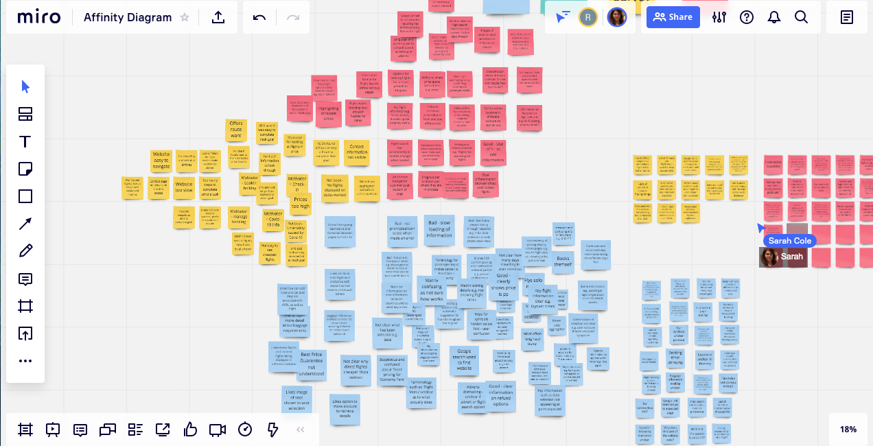
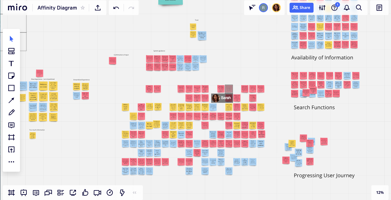
I now needed to consolidate all the research that I had gathered to analysis the bigger picture. I was asked to create an Affinity Diagram which is especially useful in summarising the qualitative data from the interviews, usability tests and survey.
I sent my sister all the relevant notes and videos from the research to review over the week before the day we had agreed to set about the diagram. I also held a brief session with her to help guide her as to what to look out for within the research. For the usability tests this was primary and secondary goals, pain points and mental models and just goals and context for the interview sections.
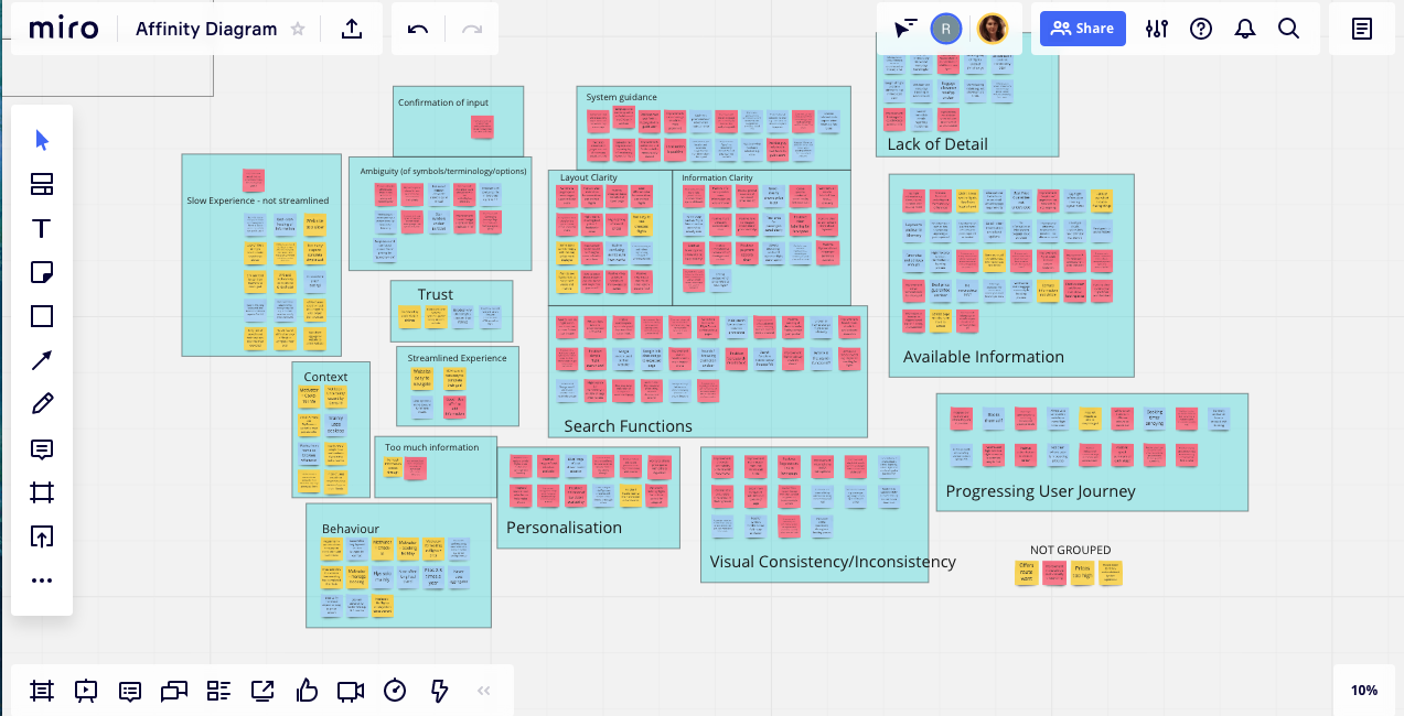
Writing our observations on the post-it notes was the easy part; we chose different colours to denote which research source the observation had come from. We then set about grouping the post-it notes by general themes which were initially titled ‘personalisation’, ‘Lack fo clarity’ etc.
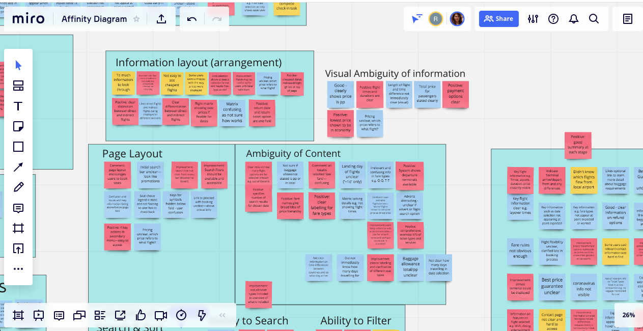
However after initially grouping the notes we realised there were a few very large groups and the group categories were rather vague – within them there could be further sub-groups. For example, under ‘Lack of clarity’ we found there was a lack of clarity due to layout or terminology. So next we sought to further divide the large groups for a deeper analysis and to reach a more granular level.
After much discussion and changing of group titles we had sorted the post-it notes with only 8 observations from the survey and competitive benchmark exercise that didn’t fit into an existing category.
Challenge
The Covid-19 lockdown meant I wouldn’t be able to conduct an in-person group workshop for this analysis, however I used Zoom to speak with my sister who agreed to help me with the analysis and then we both worked with virtual post-it notes on Miro which worked brilliantly. We were able to work in real time together and go through the same process as you would in a meeting room.
Reflection
The Affinity Diagram took much longer than I anticipated. Together we analysed and debated all the post-it notes over the course of 3 days, totalling around 9 hours.
This was in part due to inexperience, my sister’s ADHD, but also because we dissected the post-it notes and regrouped them numerous times until there were very few ungrouped and we could both agree it made sense.
Customer Journey Map
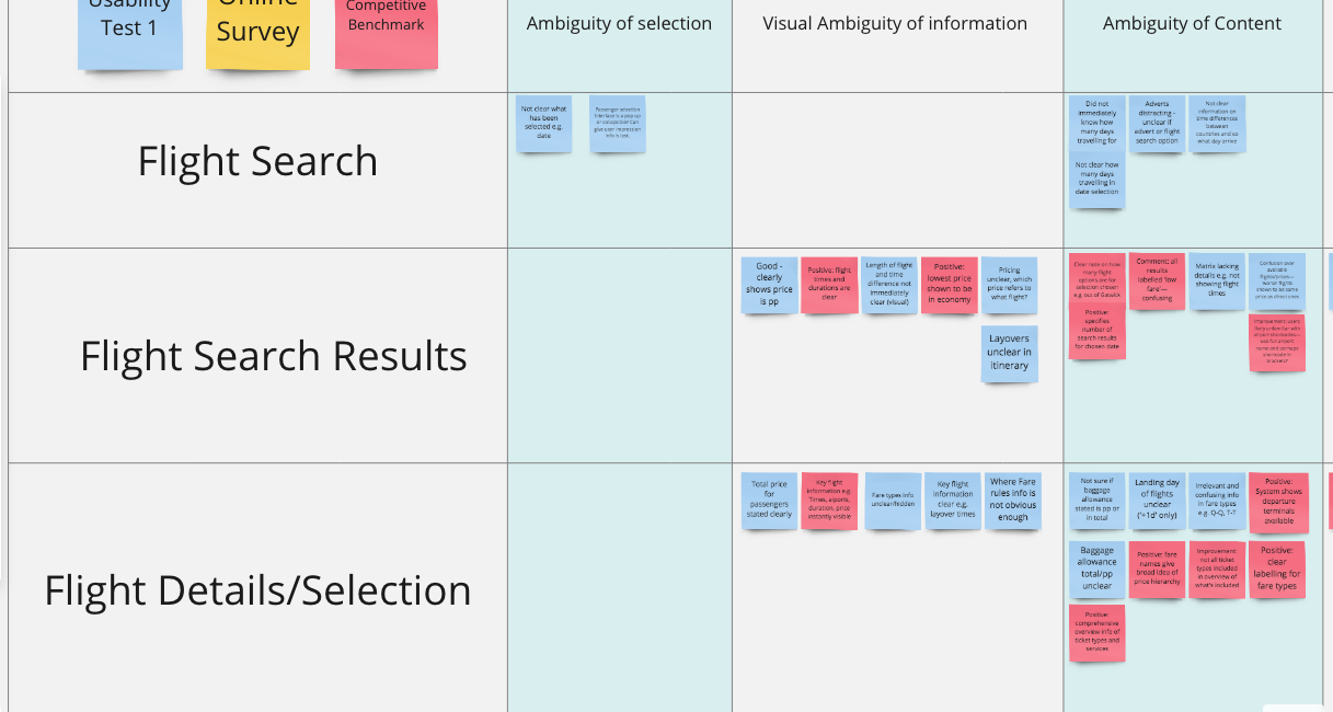
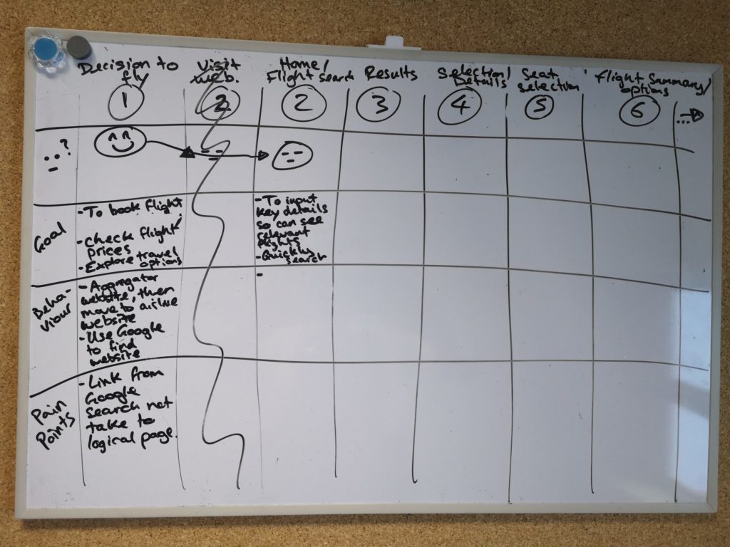
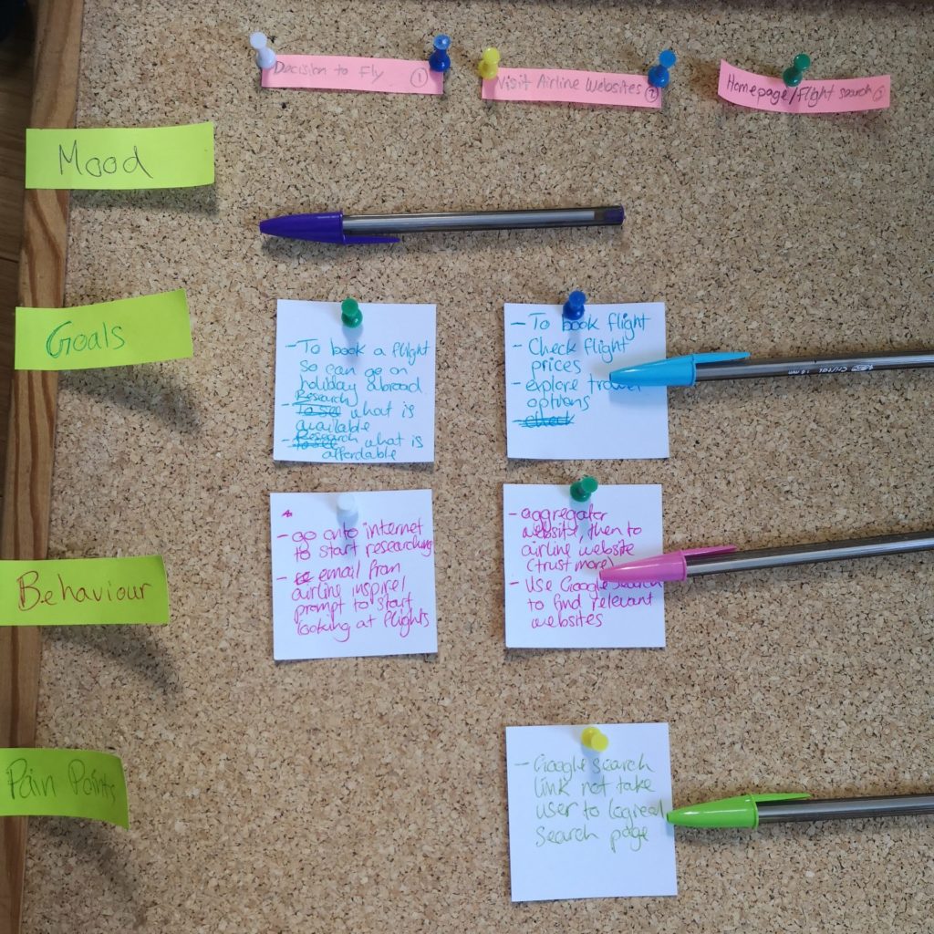
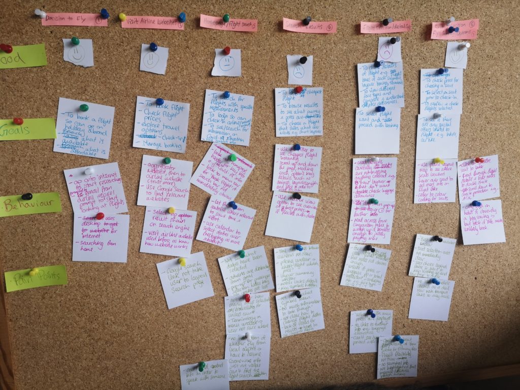
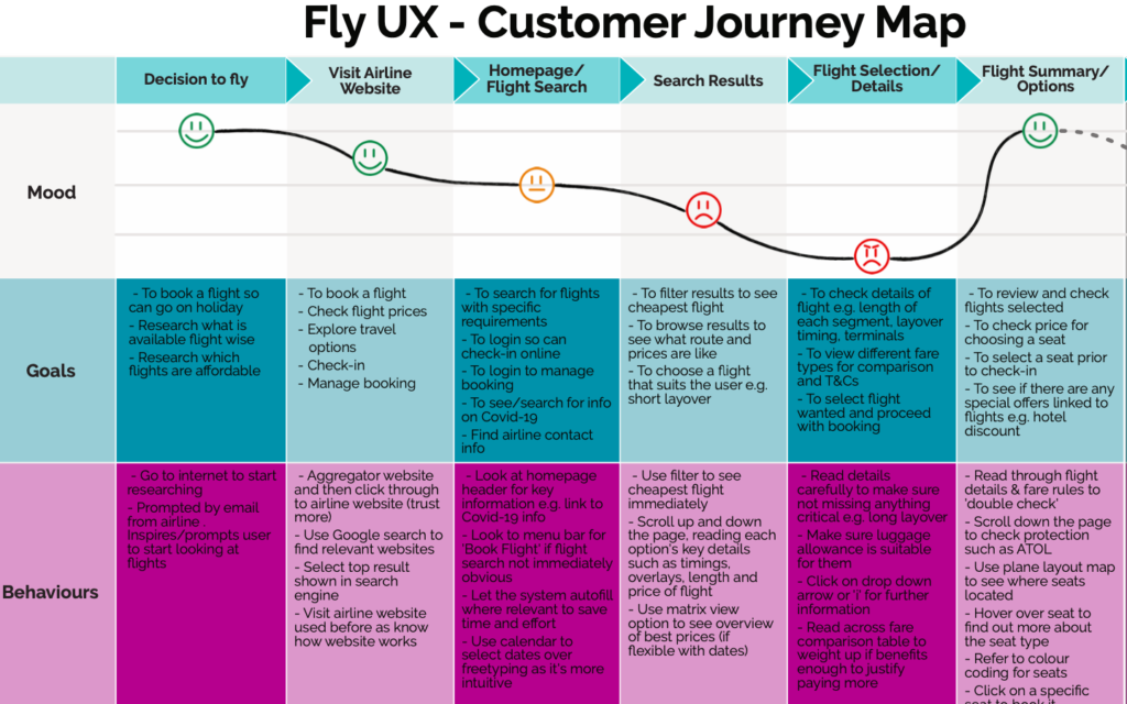
OBJECTIVE: To visualise the journey of the user as they interact with the airline website. Document pain points and assess whether it was a positive, neutral or negative experience for the user.
This was a required document for the course that allow me to visualise more the customer’s journey through the flight booking process on the desktop and see which areas particularly caused pain and so needed addressing the most.
Reflection
I felt initially that this diagram over simplified the issues that users were facing however I knew that if I were to present the Affinity Diagram to any stakeholders or colleagues it would likely be overwhelming and perhaps feel abstract. That is where a diagram such as this become invaluable and can help anyone understand the key issues at a glance.
Insights
It was obvious from looking at the customer journey map that the user experience rapidly went down hill once they had input their search parameters and were looking at the flight results.
This coincided with the step in the the booking process where the user is presented with the most information. This married up with many of the user comments about perceived lack of detail or clarity of information, thus highlighting these issues as a main point to focus on.
Analysis Conclusions
Below are the key conclusions I took from consolidating and analysing all the of research data. Many of the user issues fell across several areas below; ‘Ambiguity of Content’ and Ambiguity of Wording’ could be argued to be the same. However it was important to distinguish the root of the user’s issue so it could be addressed most effectively.
-
Ambiguity of Selection
-
Visual Ambiguity of Information
-
Ambiguity of Content
-
Ambiguity of Visual Elements
-
Ambiguity of Wording
-
Level of Information Detail
-
Information Layout
-
Feedback to User
- More feedback to the user is needed to show that an action has been taken e.g. have selected a certain flight
- Make sure that key information is easy to see, for example that the luggage is per person (pp).
- Make clear where the user can find further information or detail e.g comparing different seat types
- Information needs to be presented to the user at the point they need it and note present options that aren't available (heuristics no.2).
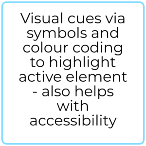
- Make sure it is clear what different symbols mean, and consider whether they are actually needed in the first place.
- Make sure colour coding meets accessibility best practices and user mental models.
- Question whether the symbols and colours add to the user experience.
- UX copywriting
- What words best match the user's mental model? e.g. baggage vs luggage.
- Make sure abbreviations make sense, or if industry specific offer information to clarify e.g. info on hover.
- Show the key differences between fare types and class types, with an option to access further more detailed information.
- Make sure the information is laid out on the page in logical order from the user's perspective.
- Needs to be easy to see key information at a glance e.g. cheapest flight option, dates etc.
- Progress bar is needed to show the user where they are in the process.
- Show the number of steps that have been taken and are to come.
- Provide a summary of what the user has already selected so they don't have to scroll back through all the pages.
Phase 3 - Concept Block
It may seem simple, but it's not simplistic
- Flow Diagram
- Interaction Design/ Low Fidelity Paper Prototype
Flow Diagram
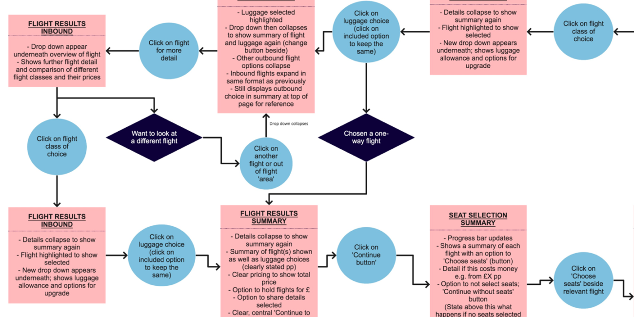
OBJECTIVE: To define the high level flow for booking flights on the new website, addressing all the issues highlighted in the customer journey app.
- Micro Interactions by Dan Saffer
This book was helpful for me to think through what type of feedback to use and how to construct rules in a way that would help guide the user e.g when making sure the user input all the data needed for the flight search to work.
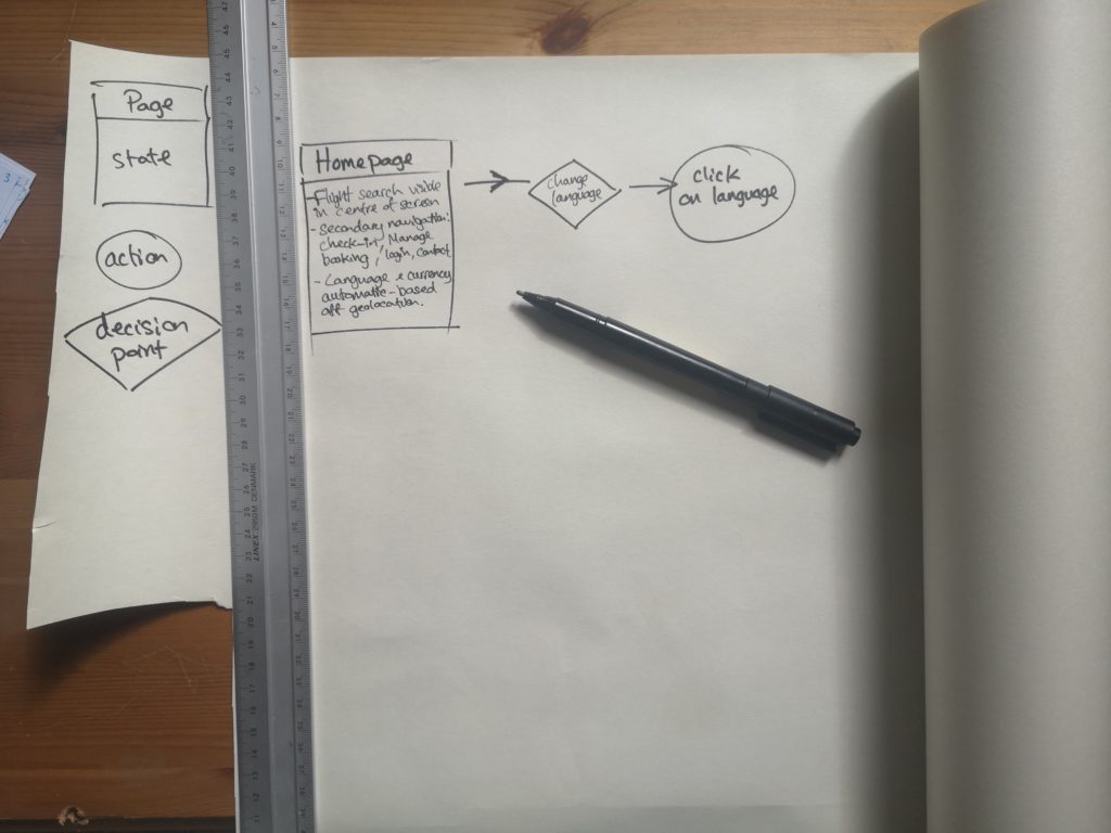
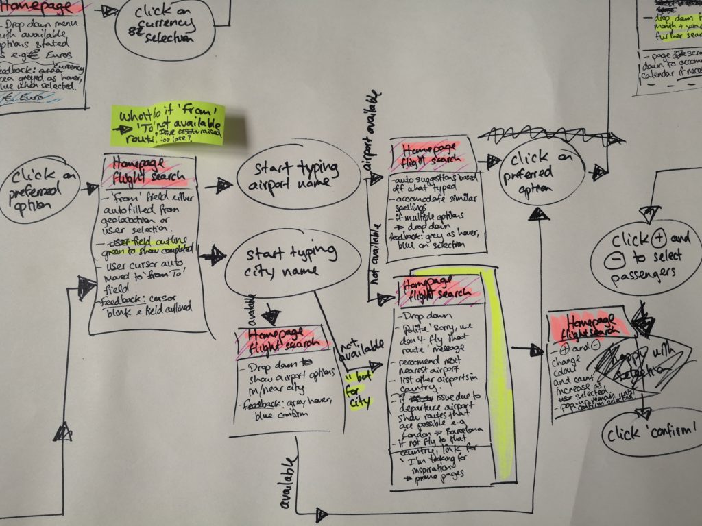
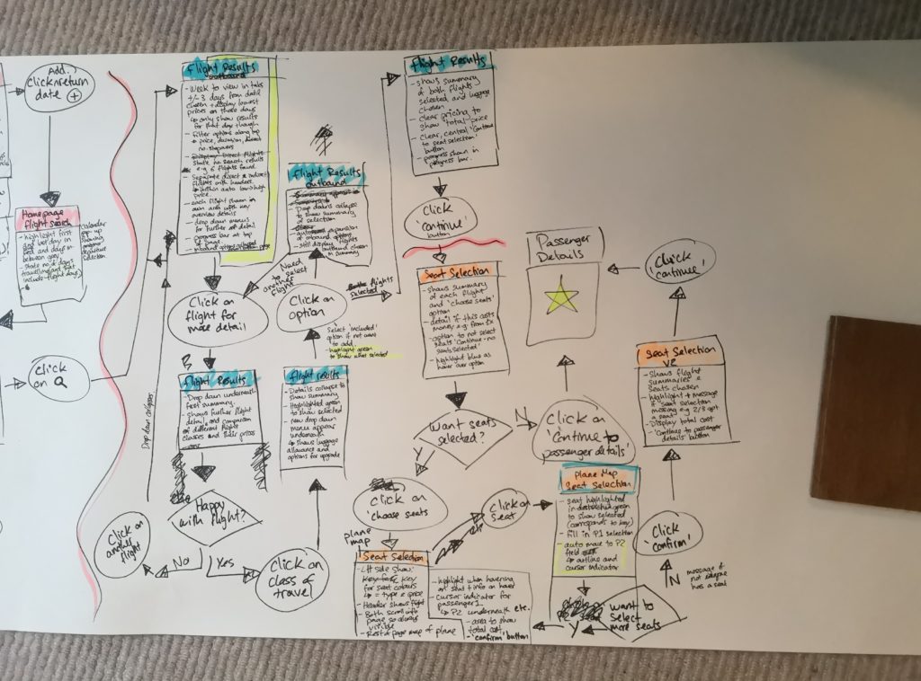
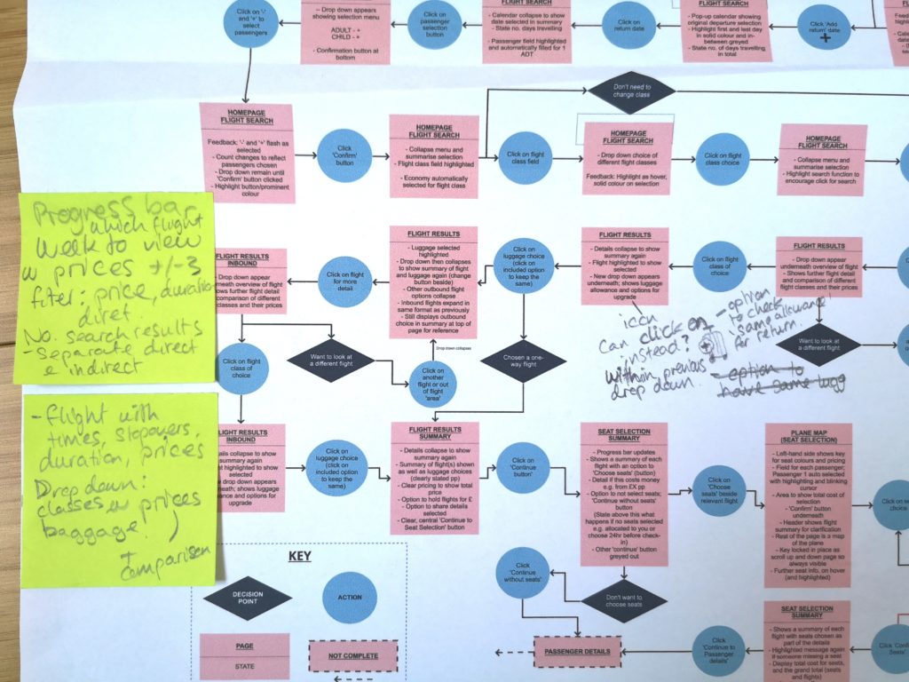
The project next required me to create a flow diagram of the main user flow through the flight booking process which was to help with the interaction design and provide structure and logic to the process.
I started out with a long roll of paper, writing down the main steps of the flow initially and then methodically visualising the user’s journey through the flight booking process in my head imagining what I would click on, how the website would respond and so forth. During the process I also considered the logic I’d learnt from coding in Python, thinking about how it might be typed out. This approach helped with the step-by-step mindset needed to plot out the detail of the flow diagram.
Finally, I used Miro for the final diagram as their tools allow for infinite space; I could be flexible with my thinking and add in extra steps easily when I reviewed my work.
Challenge
The biggest challenges were putting into practice design principles I had learnt through the course and also learning the new software! What helped me keep on track was bearing in mind the Ten heuristics as I went through the design process and referencing back to all the research I had undertaken.
Reflection
I think because I enjoy detail, thinking about the micro interactions that the user would experience through the flight booking process was fun for me. What is key in my perspective, is feedback. Through the user tests and also my own experiences I know that feedback makes or breaks an experience. Even if a website is not responding or working correctly, if you are told this is happening and there is feedback it doesn’t feel half as frustrating! I’ve learnt through my sales background and teaching that communication is critical to keeping people happy - software needs to communicate too!
Interaction Design/ Low Fidelity Paper Prototype
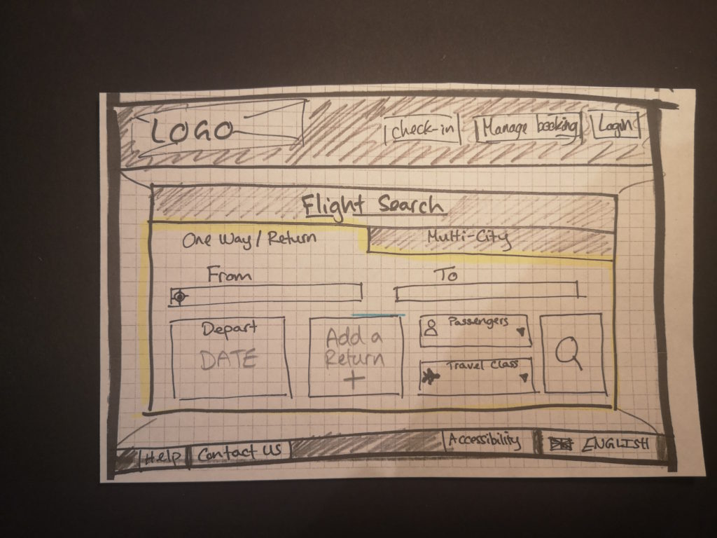
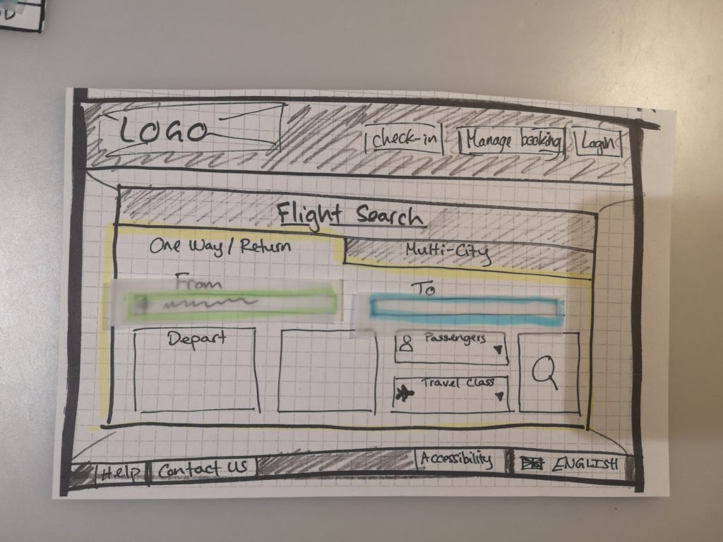
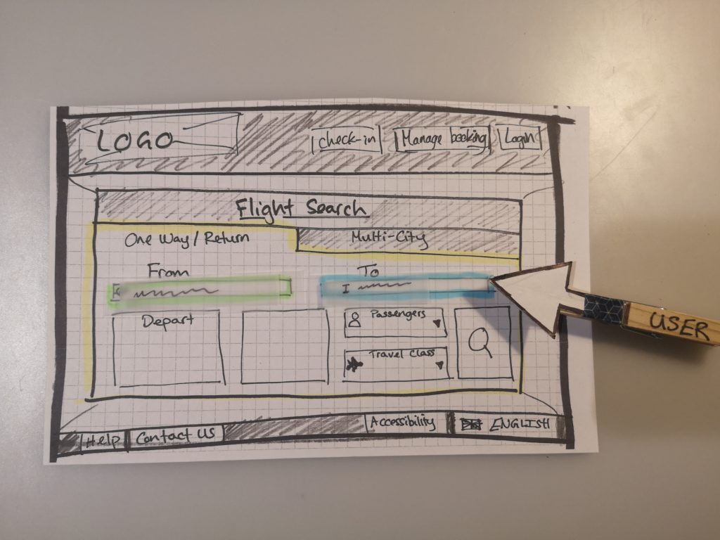
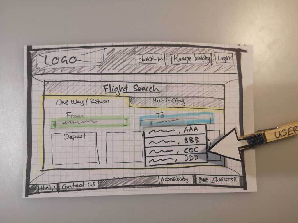
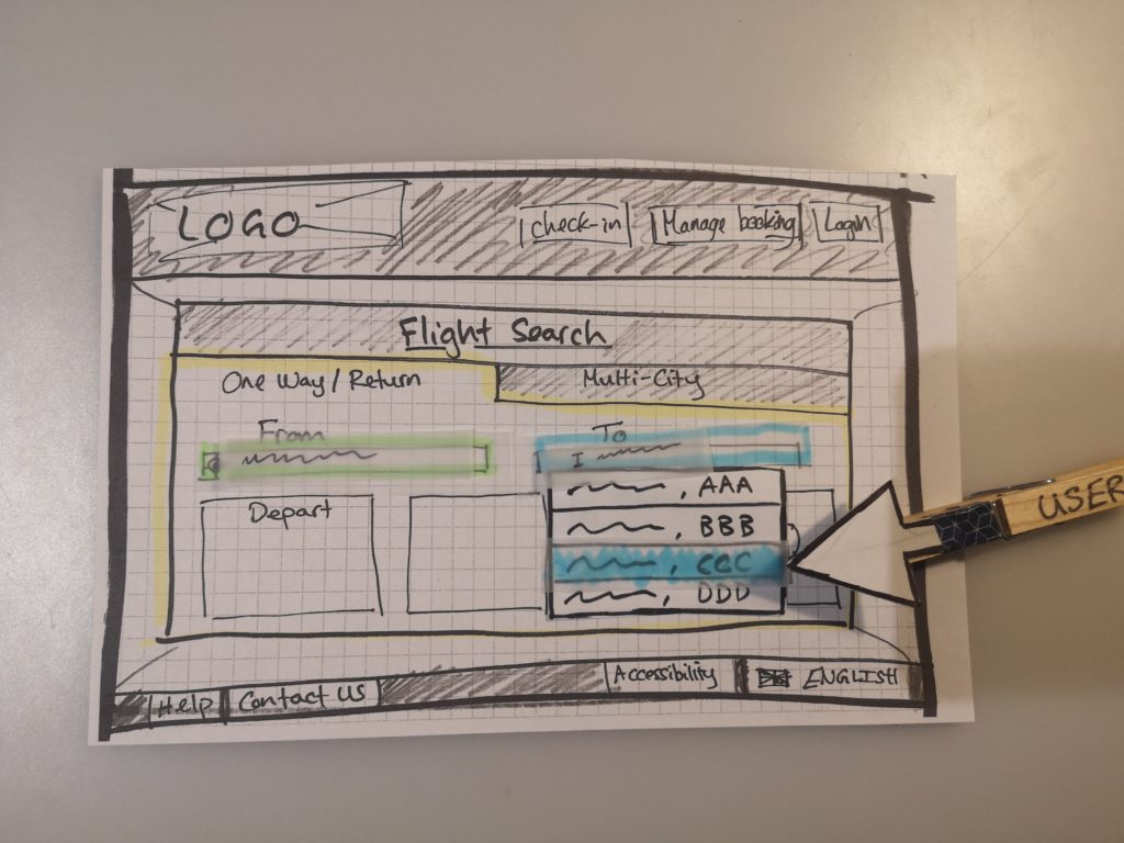
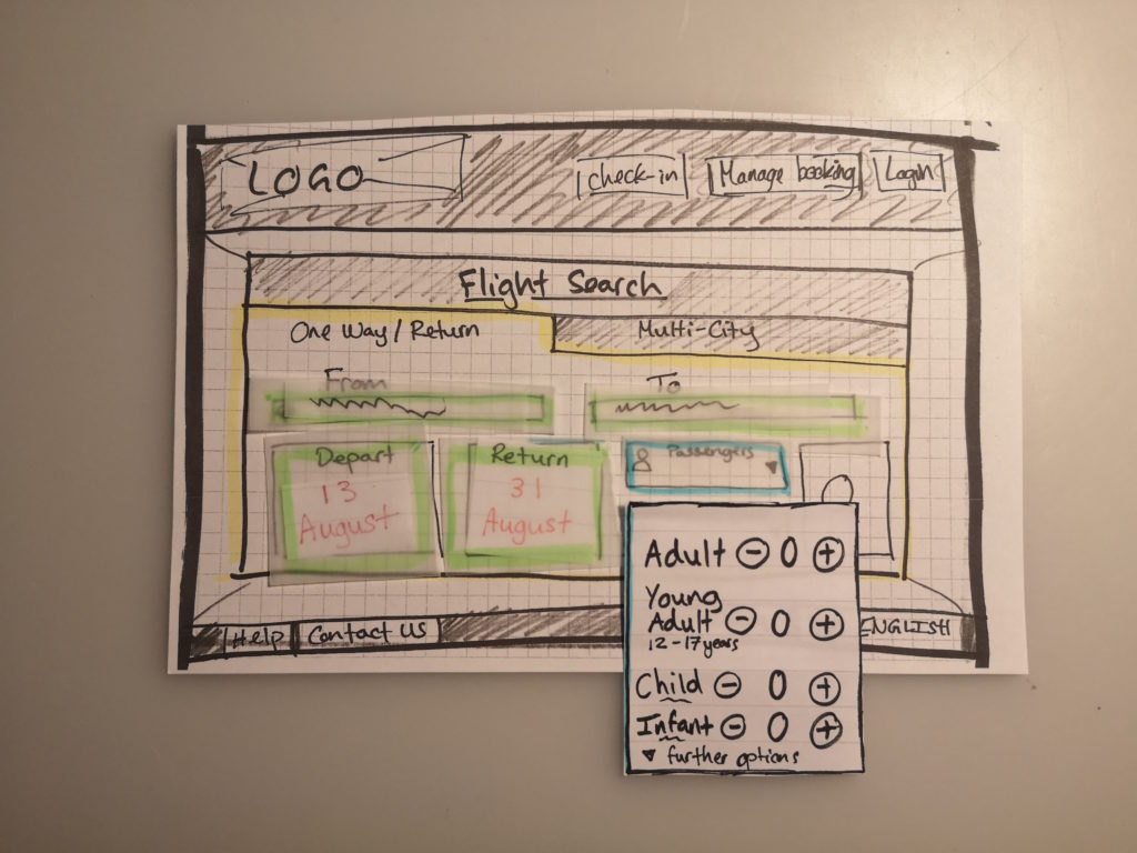
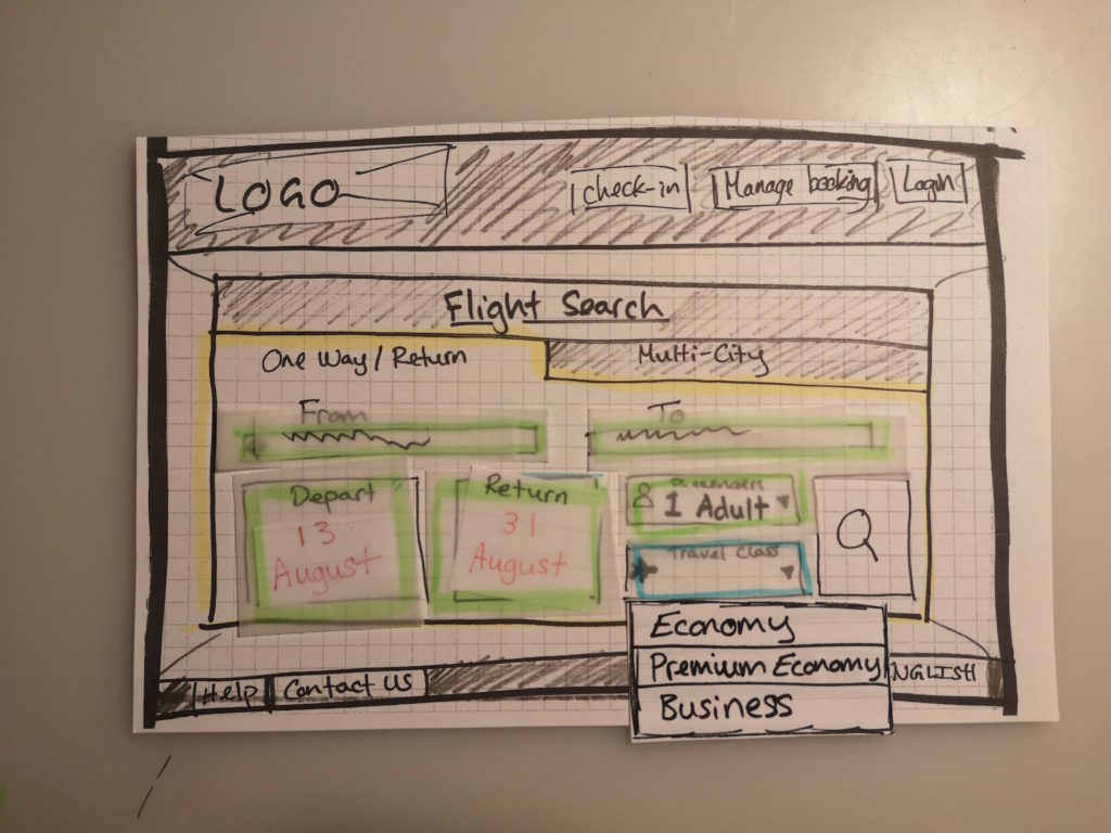
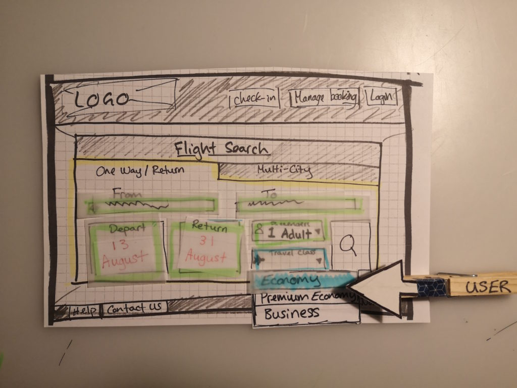
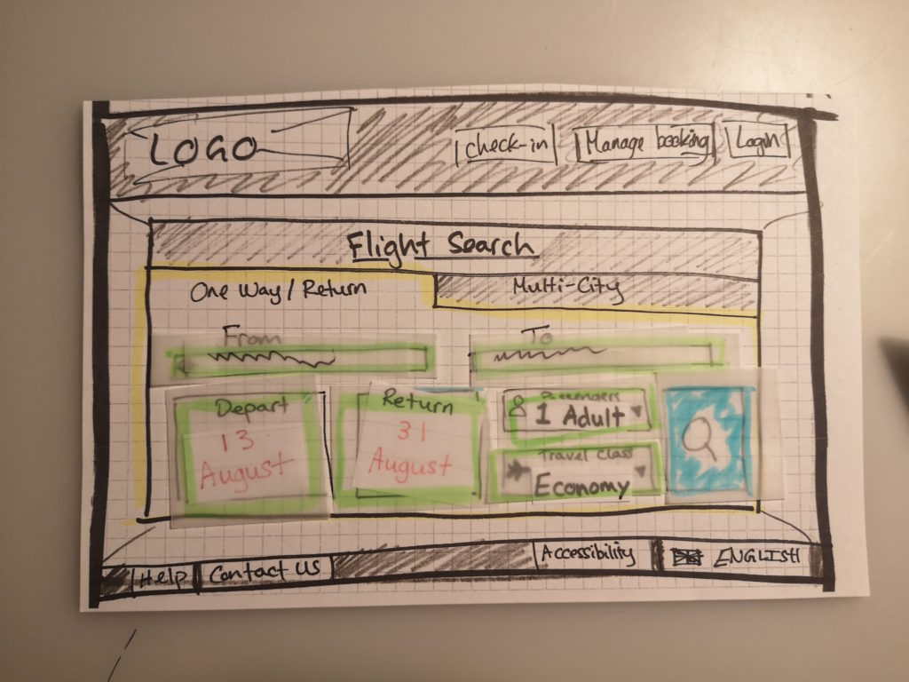
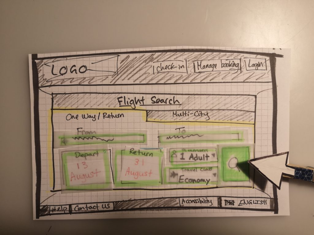
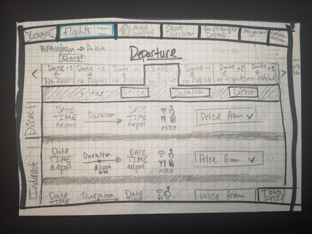
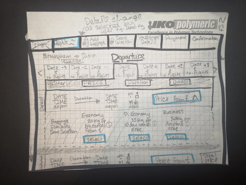
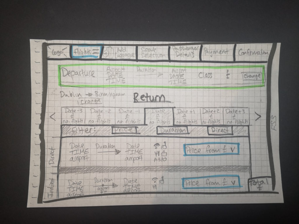
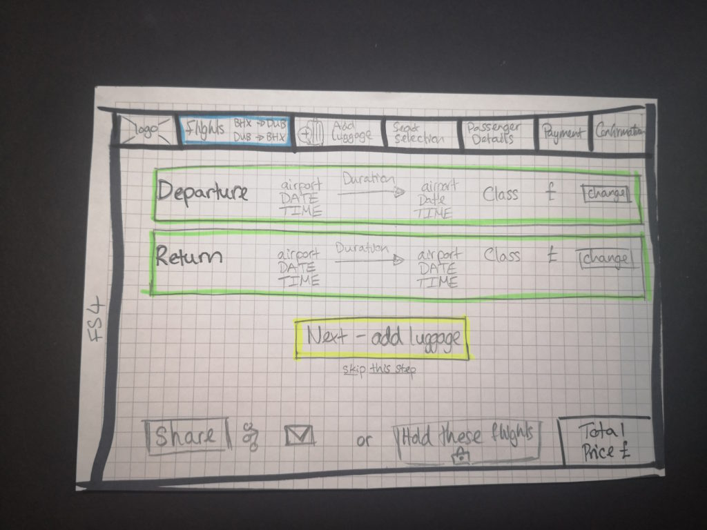
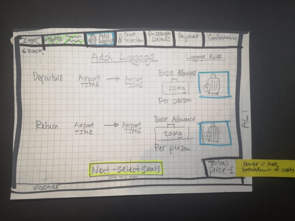
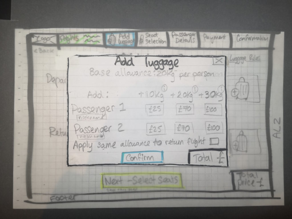
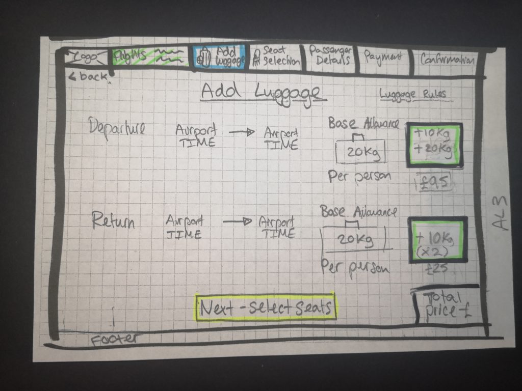
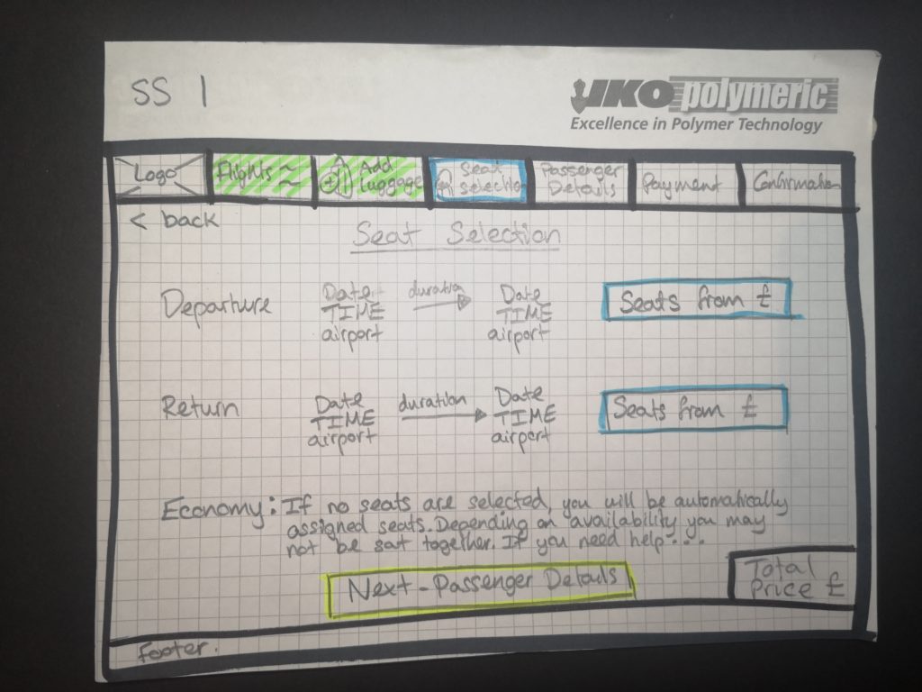
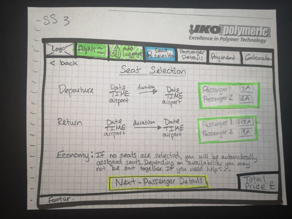
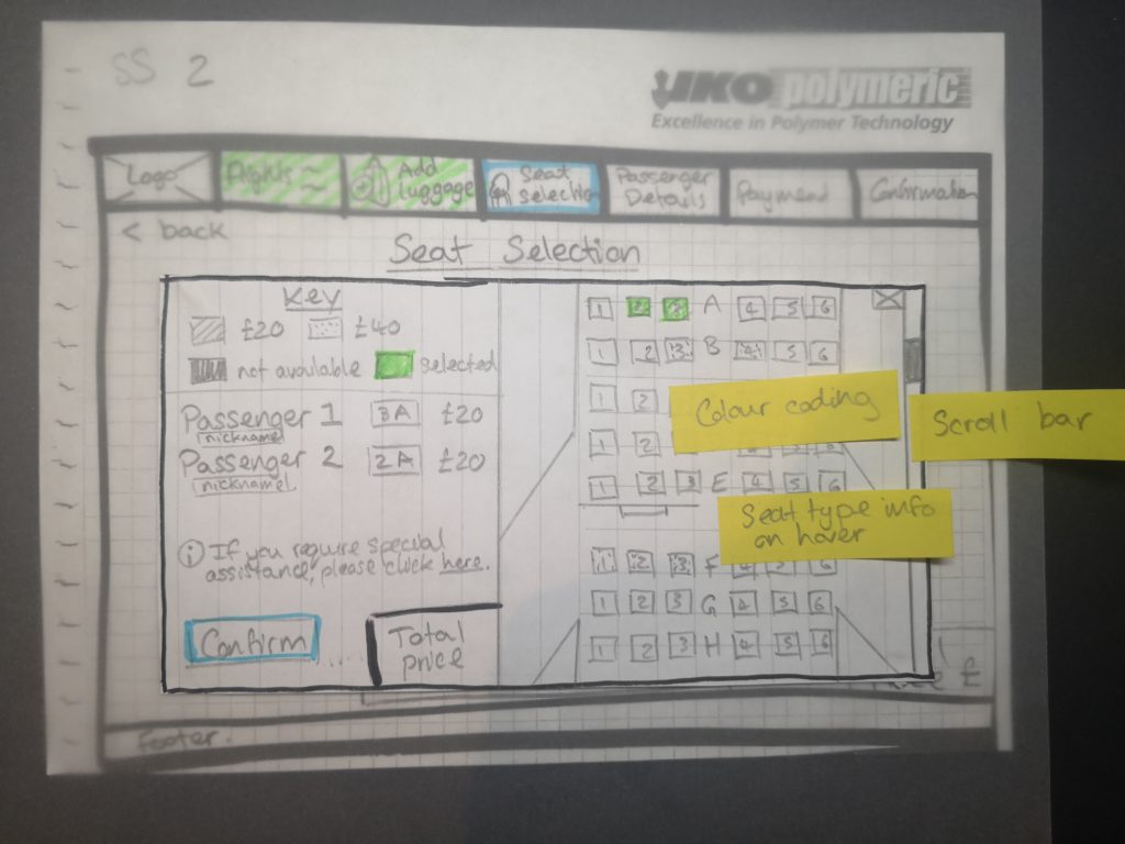
OBJECTIVE: To sketch the screens and screen states for users flowing through the flight booking process address all the issues and user goals identified in the research and analysis. Start solving the problem!
This was the start of finally designing a solution to the problems that had come to light through the research and analysis I had undertaken.
The key pain points and issue that arose for users across all the stages of the flight booking process were entered around a lack of clarity in multiple aspects; defining what they had selected, information being clearly visible and the website being forthcoming.
My proposed solution to tackle these was:
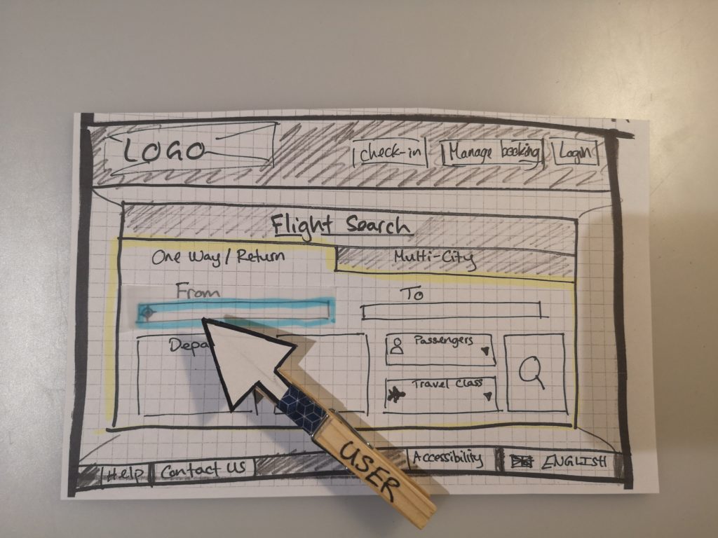
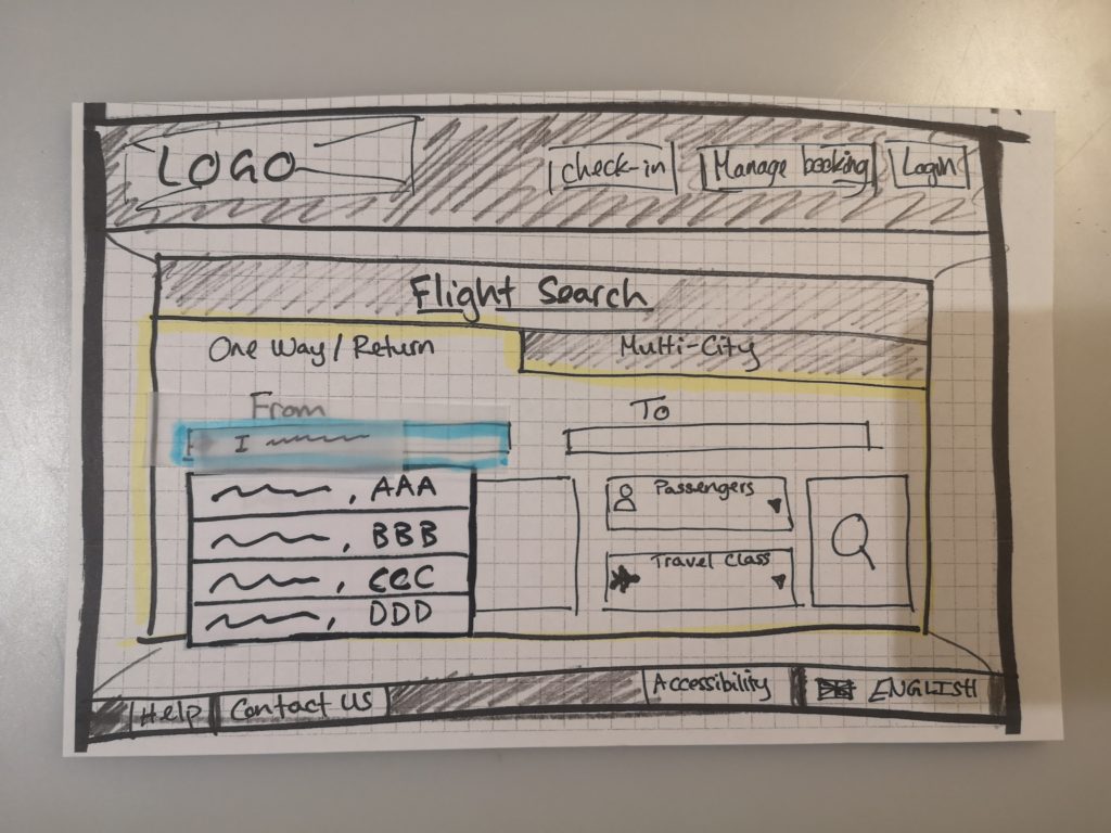
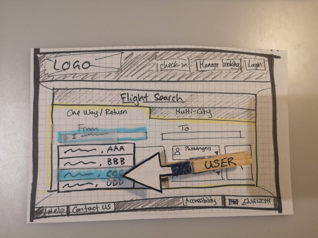
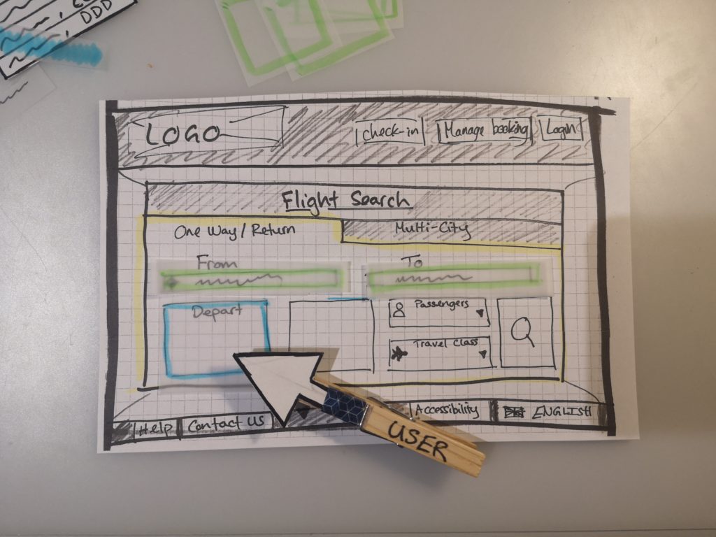
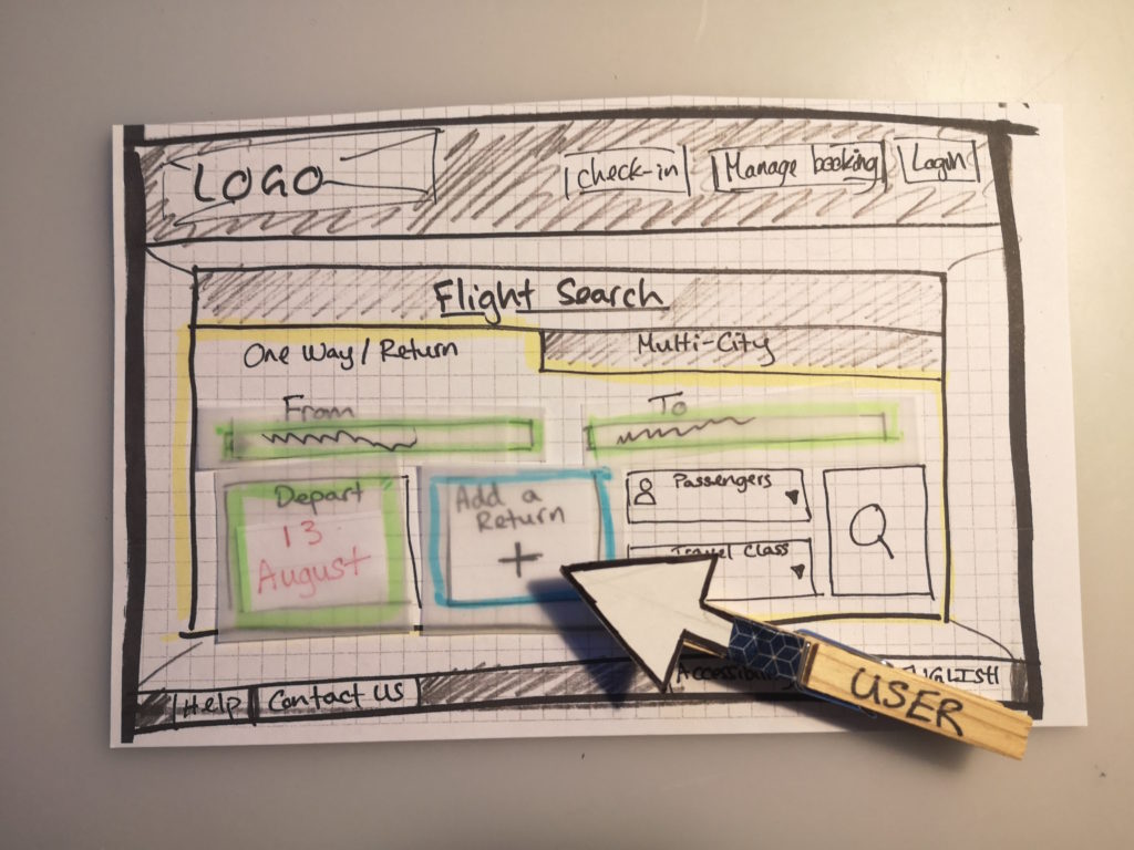
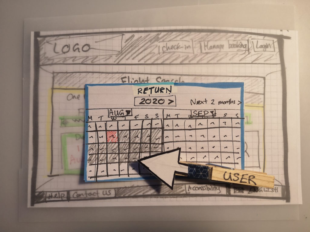
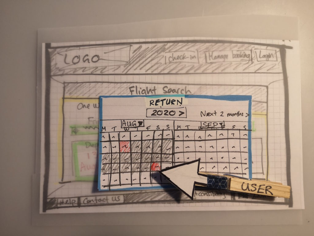
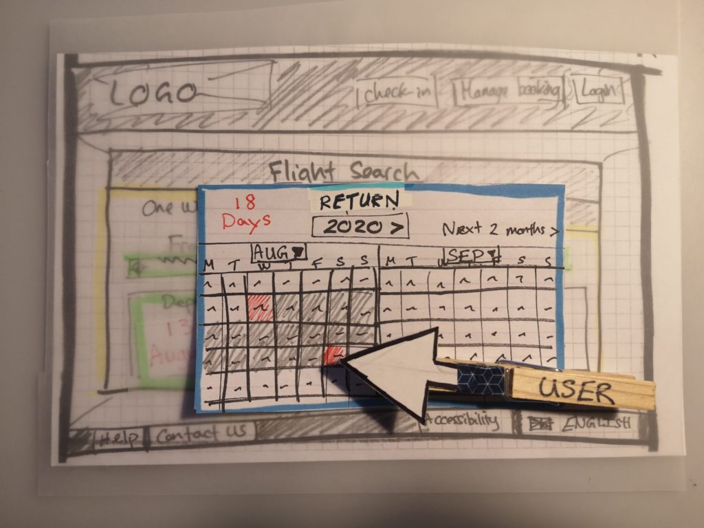
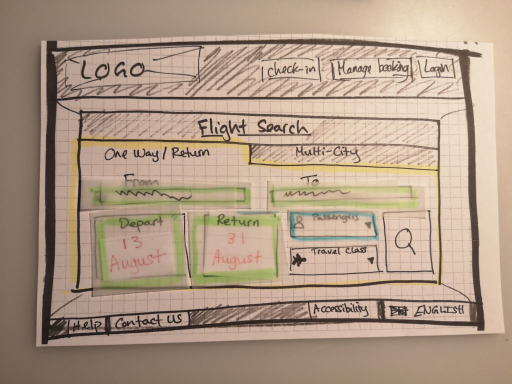
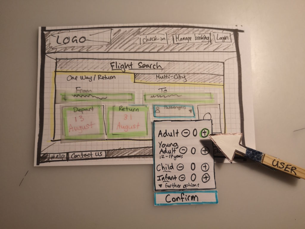
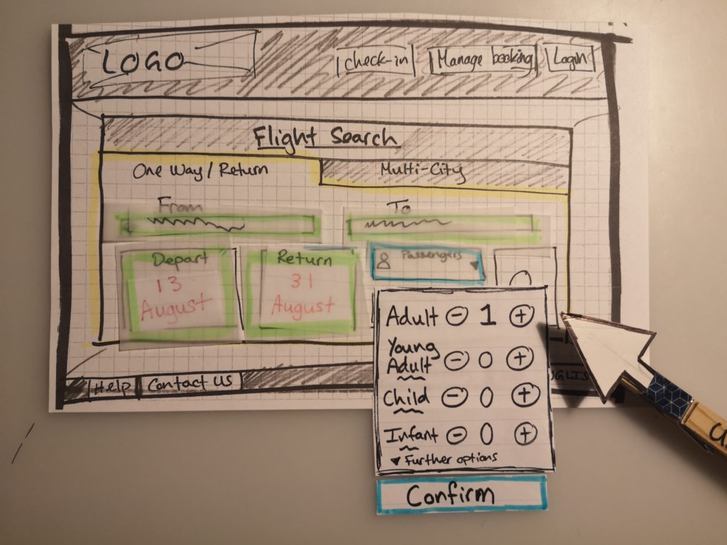
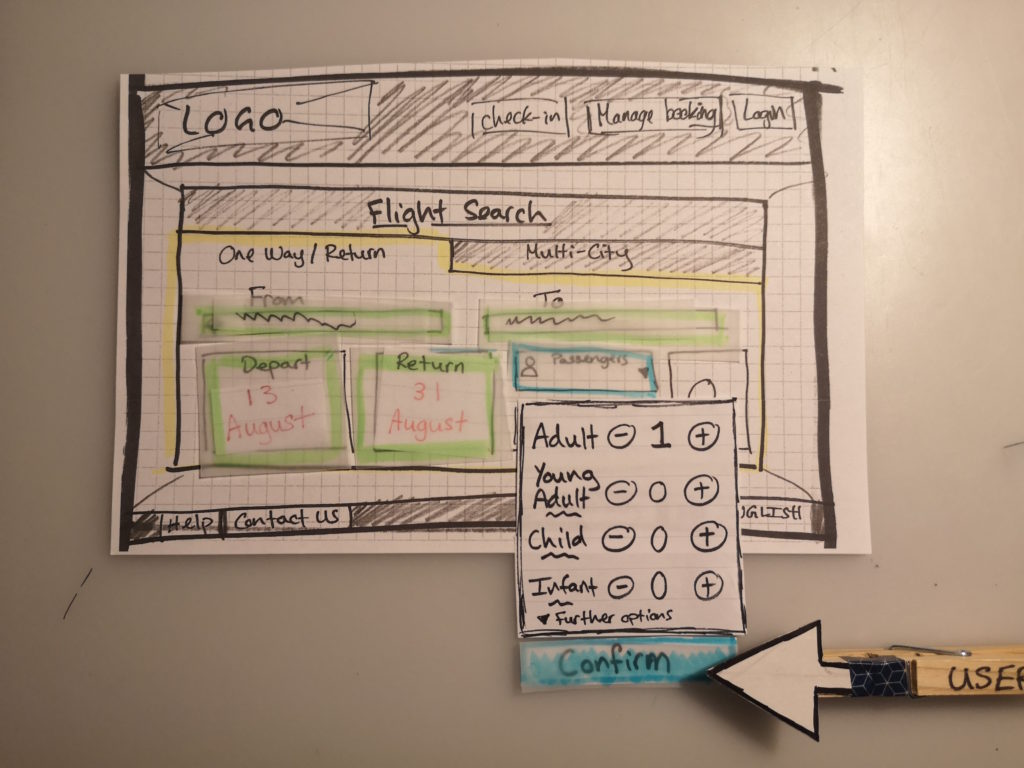
- To provide clear feedback to users on their selections through a coloured feedback system
- Accordion style drop-downs for providing further detail when needed (presenting the information at the time the user wants it)
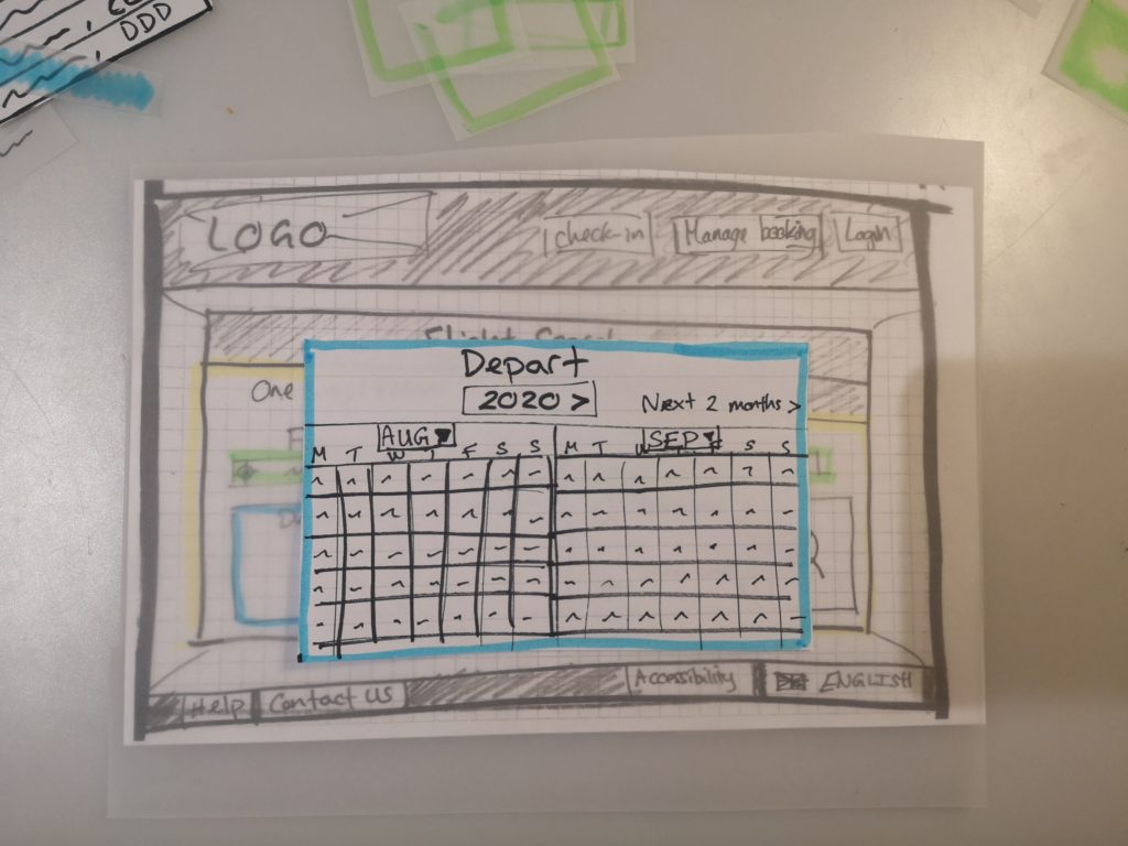
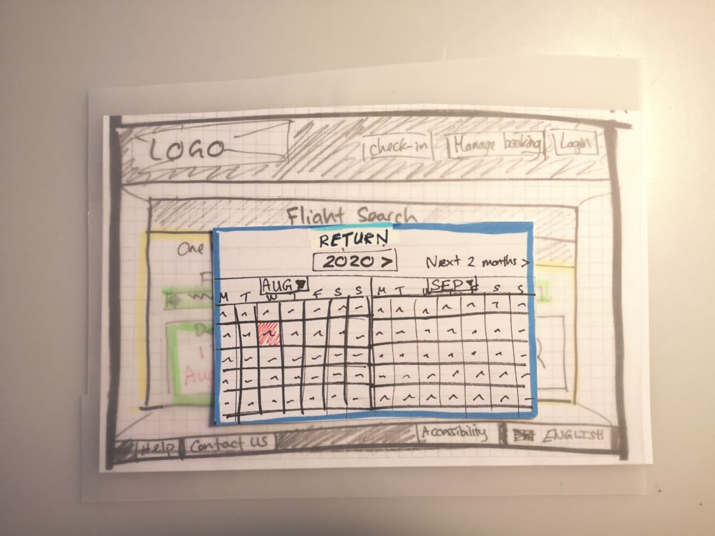
- Overlays to allow the user to see the original screen in the background for context e.g. when selecting seats.
Sketching the different screen states prevented me from getting too bogged down in the details. This approach let me plan the general structure of the pages and easily make amendments before committing to creating a mid-fidelity prototype.
As I was designing a desktop website, I created an arrow on the end of a peg to help me visualise where the user’s cursor would go and demonstrate the transition between states. As you can see in the images below, I also used tracing paper to show how the background would be less obvious to the user but still visible when they are on an overlay state.
Reflection
I realised that the design process, especially as a newcomer, is like Alice in Wonderland. As you head down the rabbit-hole of design possibilities, it almost seems endless with new ideas and psychology coming out all of the time. As someone who loves detail and the nitty-gritty, I had to keep reminding myself to keep looking at the bigger picture and key goals so I didn't include design ideas just for the sake of including them.
Phase 4 - Design Block
- Mid-Fidelity Prototype
- Usability Test V2
- Prototype Revision
- Wireframe
Mid-Fidelity Prototype
OBJECTIVE: To build a mid-fidelity prototype based off of the low-fidelity version using a popular prototyping tool. The prototype will contain enough screen layouts, text and basic interactions to allow for a high-level flow usability test.
I now set about creating an interactive mid-fidelity prototype so I could test the various key features that I thought would help solve the frustrations and issues of users I had gathered in the research phase. This included drop downs, colour around inputs to provide user feedback, overlays and information summaries. As well as these I wanted to write proper UX copy within the prototype as one of the recurring issues for users was confusing terminology and a lack of clarity as to what certain sections meant. By including the copy I could test this aspect out in the usability test and refine what terminology worked best for users.
FLYUX Version 1 Prototype Walkthrough
There were some restrictions with the AdobeXD software and my ability, which meant that I wasn’t 100% able to replicate what I envisioned. For example, I wanted there to be a much shorter fade out time after selecting a departure date and also clicking off the screen after selecting a date making it update. My efforts to achieve this made the prototype act wrong, and so I decided it was good enough for a usability test as it would give a similar experience to what I wanted to achieve.
Challenge
The prototyping software was by far the greatest challenge here. I chose AdobeXD as I had experience with the Adobe Suite and I expected there to be many similarities in the layout, tools, and general logic - I was wrong. I realised quite early on that it was essentially a standalone piece of software. Thus I set about watching a lot of online tutorials and webinars on how to use the software as the Diploma course didn’t provide training on any of this.
I got a bit obsessive about the details and had to keep reminding myself it was a mid-fidelity not a high fidelity prototype. The key point was to think of the features I wanted the user to be able to test rather than creating all the possible functions.
Reflection
I also wanted to try Figma for this project, however I live in a village with a copper wire internet connection that coupled with my poor old laptop, just couldn’t cope - I thought it was going to catch fire.
It would be fantastic to have official training with various softwares so I can create a wide-variety of prototypes and understand which software is best for certain projects.
Usability Test V2 + Revision of Prototype
OBJECTIVE: To test the mid-fidelity prototype I had created to find out if it adequately solved the users pain points and issues. To understand issues and pain points for the user in the prototype and change the design as needed based off the feedback.
In order to help improve my prototype and make sure my ideas had solved the user issues I set out another Usability test. Again due to the Covid-19 pandemic I was limited as to whom I could ask to undertake this test and so I asked my sister on this occasion. Although she wasn’t ideal (as mentioned before) I felt her lack of experience navigating airline websites could also be helpful in understanding if my design made sense to a ‘novice’.
Revising the Prototype
One change here was that although the information in the progress bar was useful, the user tried to click on it a number of times to go back to a previous page which wasn’t initially factored in. Although I had included ‘< previous page’ options I decided to make sure the progress bar was clickable too to fit in with the heuristic idea that software should allow the user freedom to navigate their way. This also lead me to include graphic arrows to emphasise progression in the process for the user.
Reflection
It would have been much better to have tested the prototype on more users. Although the changes I made to the prototype made sense to me, I would have liked to have more confidence in the design decisions by having a wider range of comments and observations.
I also realised during the usability test that I had made an error in the scaling of my design. I had used an external monitor much larger than the usual laptop, and so when observing I noticed information such as the flight date bar were much larger than intended or needed to be! I put this down to experience and practice.


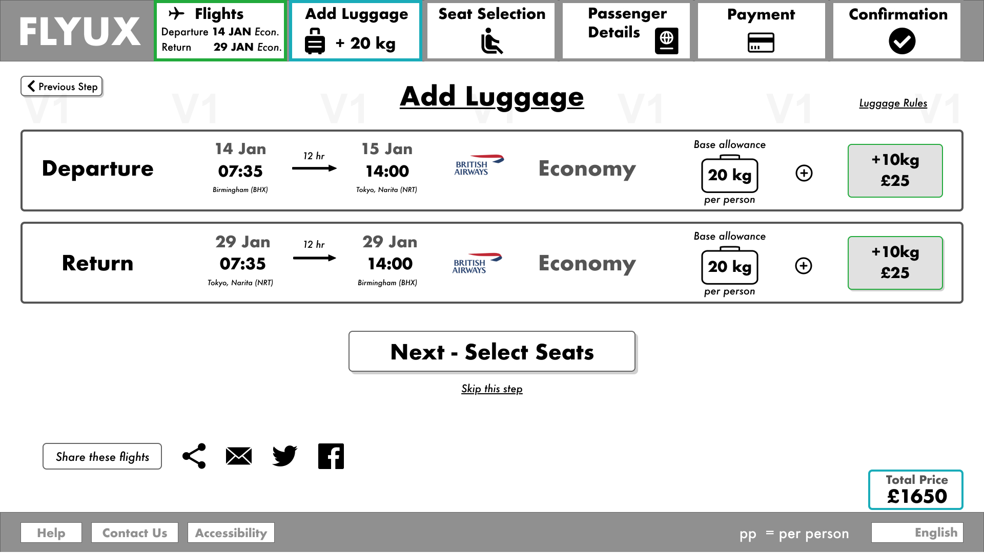
Another of the more obvious changes I made was in relation to the baggage screen. Throughout all the research users had consistently stated they found the baggage allowance unclear and weren’t sure how to add more baggage. When conducting my prototype usability test, the user raised questions and queries about their total luggage allowance after adding 10kg. This led me to create a ‘Total Allowance’ highlighted icon to emphasise the total allowance. I also had the original allowance grey out to focus the user on the new baggage allowance for them.
As well as this, I edited the copy on reflection to be more in line with the industry. I changed it from ‘base allowance’ to ‘basic allowance’ and from ‘luggage’ to ‘baggage’. This change was inspired by a talk by Laura Parker on UX Writing. To help general comprehension I needed to aim for the reading age of a 9 year old and also match the general terminology used by people when talking about the subject.
Key changes made to the prototype: Version 1 vs Version 2
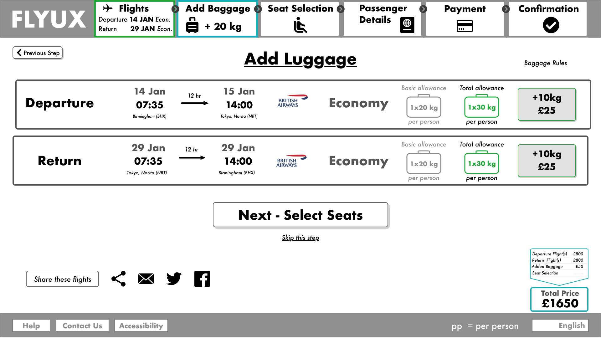
Other changes to the prototype included making the Total Price breakdown always visible by default and amending the Flight Results pages. I had originally intended the ‘+1’ and ‘-1’ to move the screen on by a day however, although this was not a clickable feature at this time, the user assumed it would move the dates by a week. Looking back to the research and reflecting on the recorded usability tests provided by the UX Design Institute, I decided changing to a week’s shift was more in line with the mental model of users, and would work with the user goal of browsing flight prices.
Wireframe
OBJECTIVE: To create a set of wireframes containing all. the necessary detail a developer would need to build the application accurately.
The final part of the project was to provide detailed wireframes that would help the developers create the prototype in reality most accurately. Having studied Python, HTML and CSS in my own time and through TechUp I had an understanding of the type of details and clarifications that would be required to be able to code a page.
As well as this I read a great article by Andrew Smyk I discovered on AdobeXD ideas which really helped me make sure I was including relevant information for developers too, such as stating whether an area of text is conditional, error messages, where the error messages would sit within a page, and fixed elements when the user scrolls.
Reflection
As I really enjoy detail and have coded myself as part of the TechUp course, I felt this part of the project came very naturally and it was quite easy for me to empathise with the developers and think about what I would want direction on if I had to code the webpage.
Conclusion
What did I learn?
Working through the project alongside my studies was a great opportunity to put my new knowledge if UX principles into action and gave me the opportunity to learn and practice the software I will be using daily in my UX career.
Aside from these basics, what I really learnt is that UX is very much a cycle whereby you need to constantly reflect on what you are doing, what your aims are, and then double checking your designs actually solve the problem for users. Rather than being arrogant and thinking you have it right first time, you need to take a step back and accept that your first attempt is probably not going to be the best attempt at solving the user problems.
What would I have done differently?
The biggest change I would have made is increasing my research base i.e. having more survey participants, conducting more interviews and usability tests. This would have allowed me to be more confident in the insights from my research and perhaps have revealed other issues that didn’t come to the foreground.
What would I like to do next?
Developing my software skills further would be useful to create a better prototype which I could conduct more usability tests with to test my designs. Also I would like to create a mobile app version of the airline website to understand user issues when using a smaller screen and also to practice consistency of design across devices.


